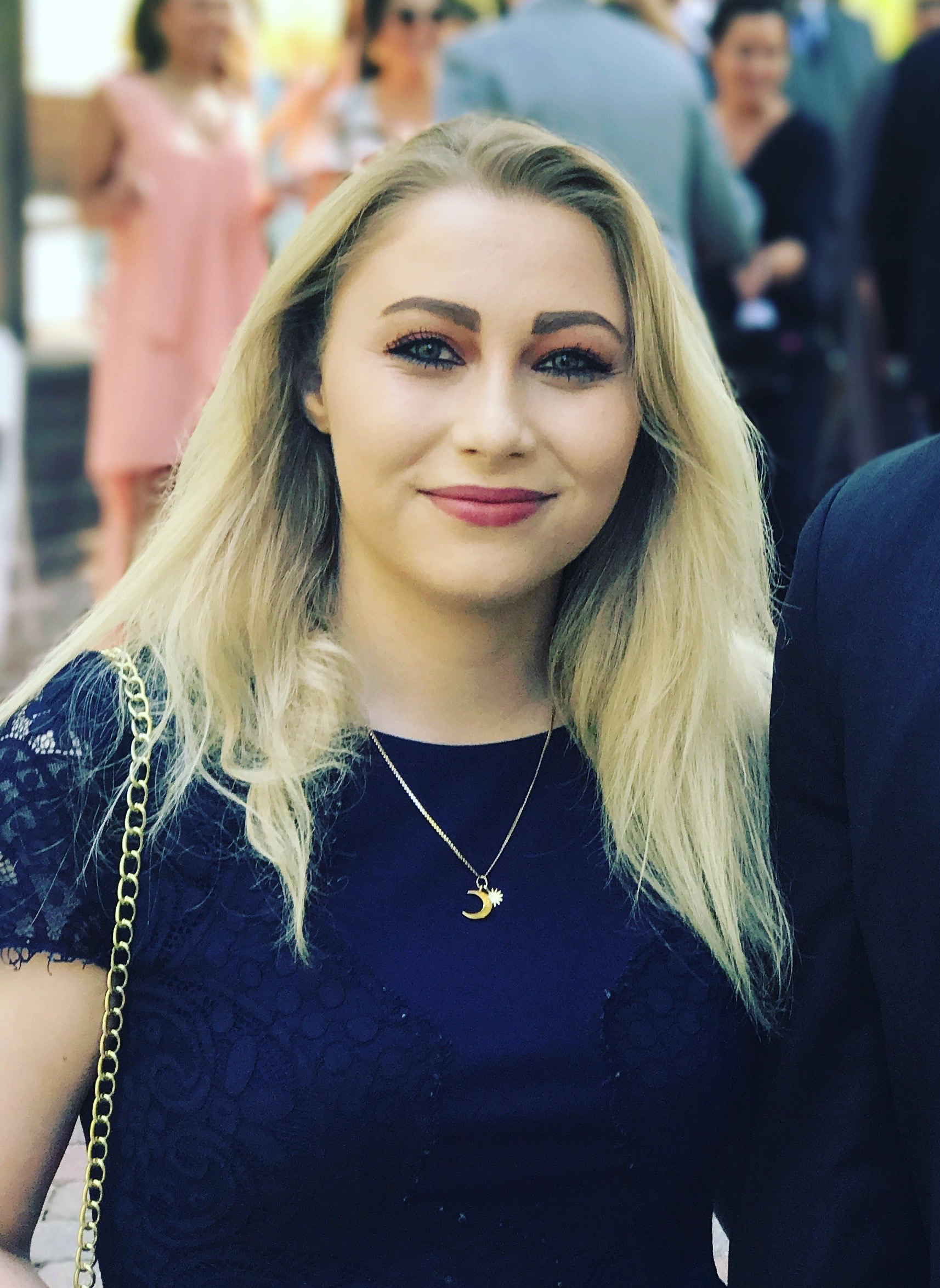
Hej, vällkommen – I'm Bella.
A few things to know about my work...
I'm currently a Graphic Design student at SCAD, where I'm diving deep into the world of grids, typography, visual systems, and – inevitably – far too many artboards. Alongside school, I freelance for a small creative agency, where I continue developing my skills in design, photography, and visual storytelling.
My work is heavily inspired by Nordic and Scandinavian design philosophy and contrasts: clean but warm, minimal. yet deeply intentional, with a strong emphasis on craftsmanship, functionality, and atmosphere. I'm especially drawn to the balance between restraint and personality; the idea that simplicity doesn't have to feel cold, and that minimal design can still feel playful, human, and emotionally resonant.
My strongest passion lies in brand identity design – building thoughtful visual systems that extend far beyond just aesthetics and a logo. I love exploring how typography, color, composition, imagery, and subtle details work together to create brands that feel cohesive, distinctive, and memorable.
Long term, I hope to continue growing as a brand designer, ideally contributing to thoughtful design work on an international scale. I've always felt deeply connected to Nordic culture and design, and one of my biggest goals is to eventually live and work abroad in a Nordic country – creating meaningful work in an environment whose values strongly align with my own.
A few things about my life outside of design...
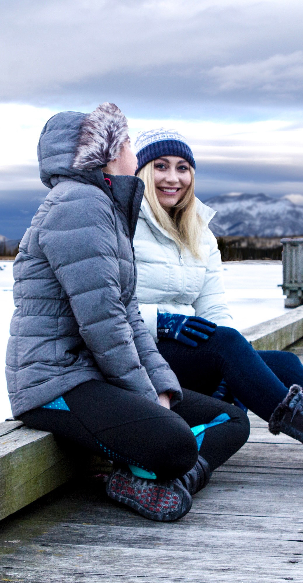
I'm endlessly curious about other cultures, I play women's ice hockey, and I'm always juggling side projects. When I'm not obsessing over typefaces, layouts, or color palettes, you'll probably find me walking my Maine Coons, Aurora and Merlin, or on Babbel attempting to improve my Swedish.
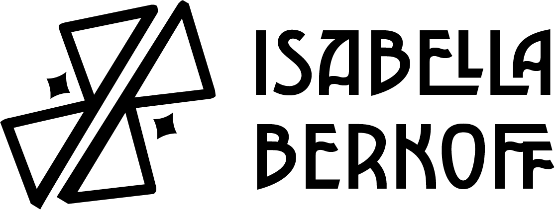
The story behind my logo
My personal logo is inspired by the Nordic rune Bjarkan (ᛒ), the rune associated with the letter B.
The symbol is created by mirroring two runic B forms, representing Bella Berkoff reflected back on itself. The mirrored structure creates a visual sense of symmetry, duality, and balance, all of which feel central to both my personality and design approach.
Depending on how you view it, the mark can take on multiple meanings: mirrored initials, mountain peaks reflecting from a fjord, or a symbol of equilibrium and structure. I love that it feels both ancient and modern—rooted in Nordic history while still feeling clean, geometric, and contemporary.
That intersection of heritage, symbolism, and simplicity is at the heart of how I approach design.