Brand Identity | Logo Design | Web Design | Content Creation
Software: Adobe Illustrator | Photoshop | Procreate | Figma
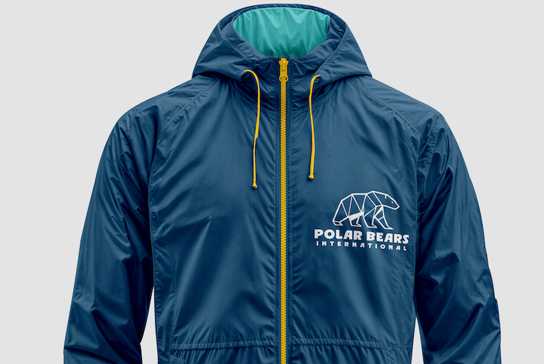
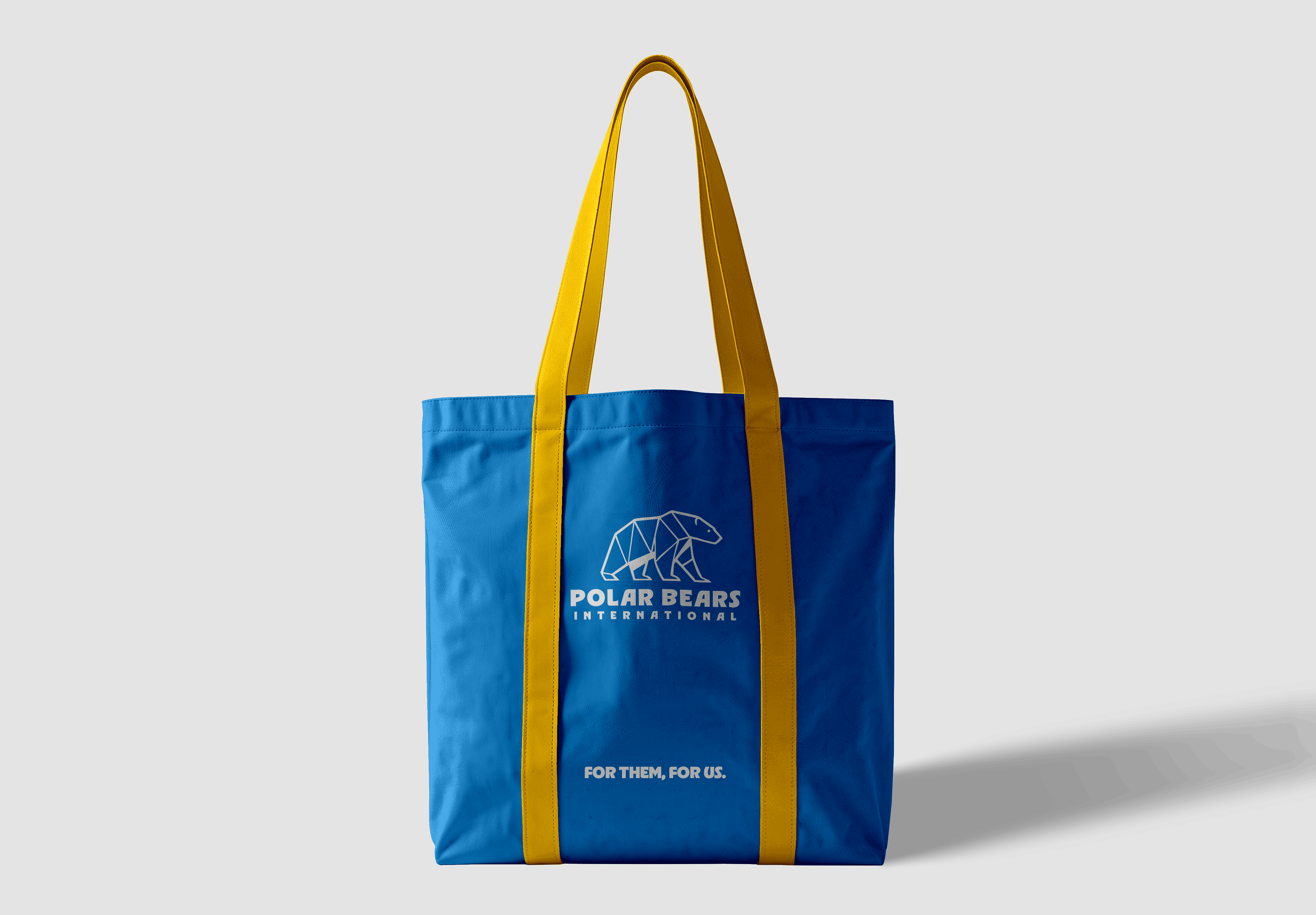
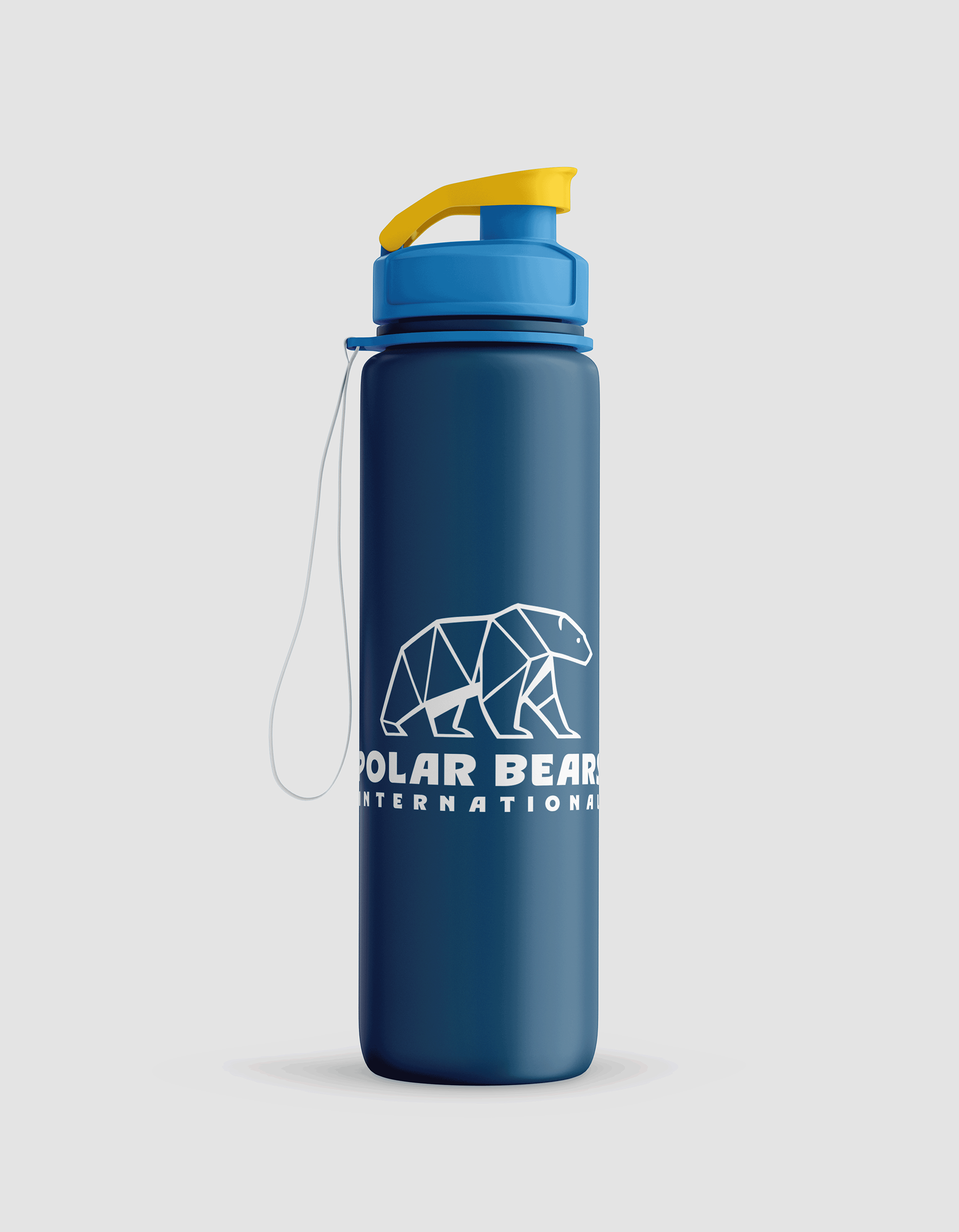
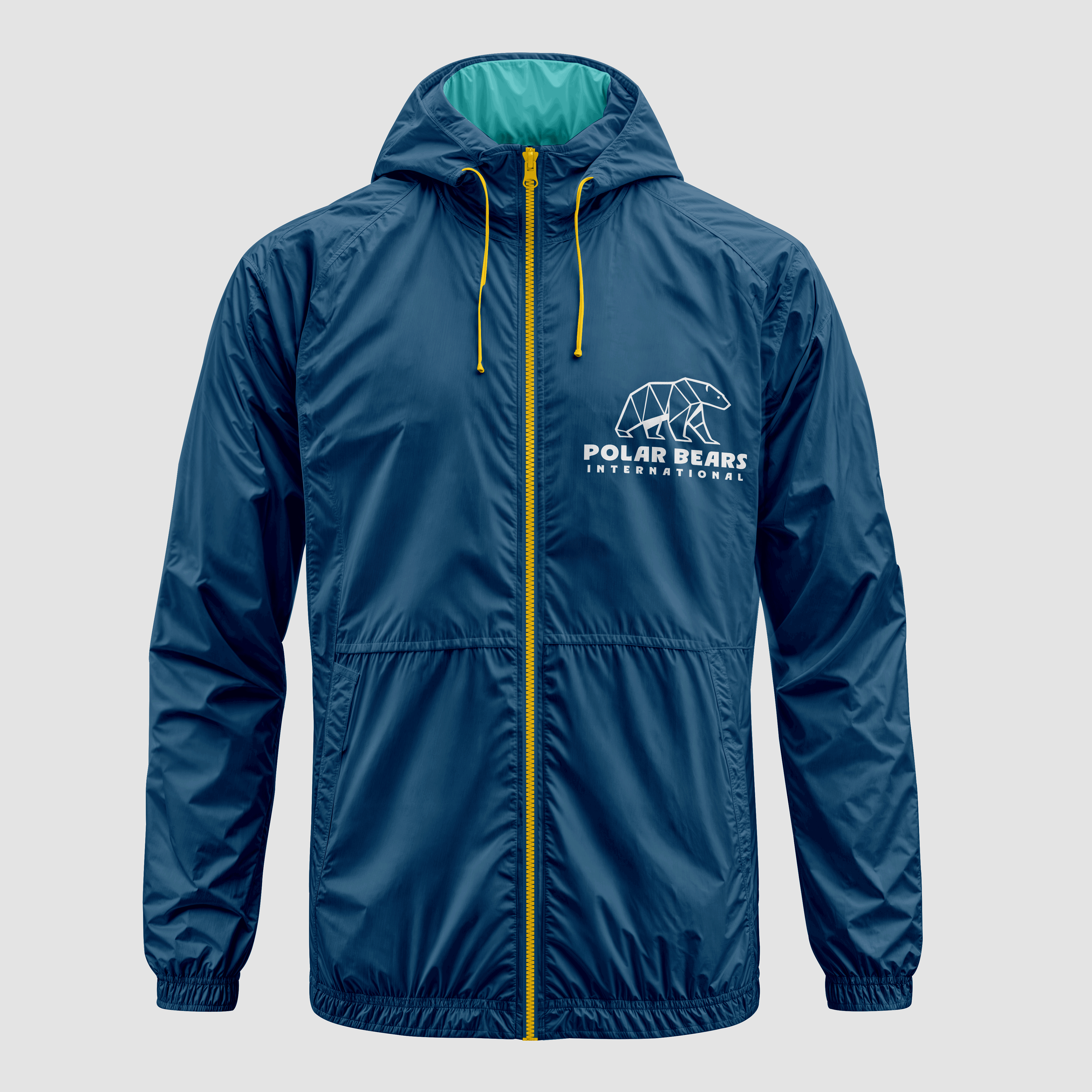
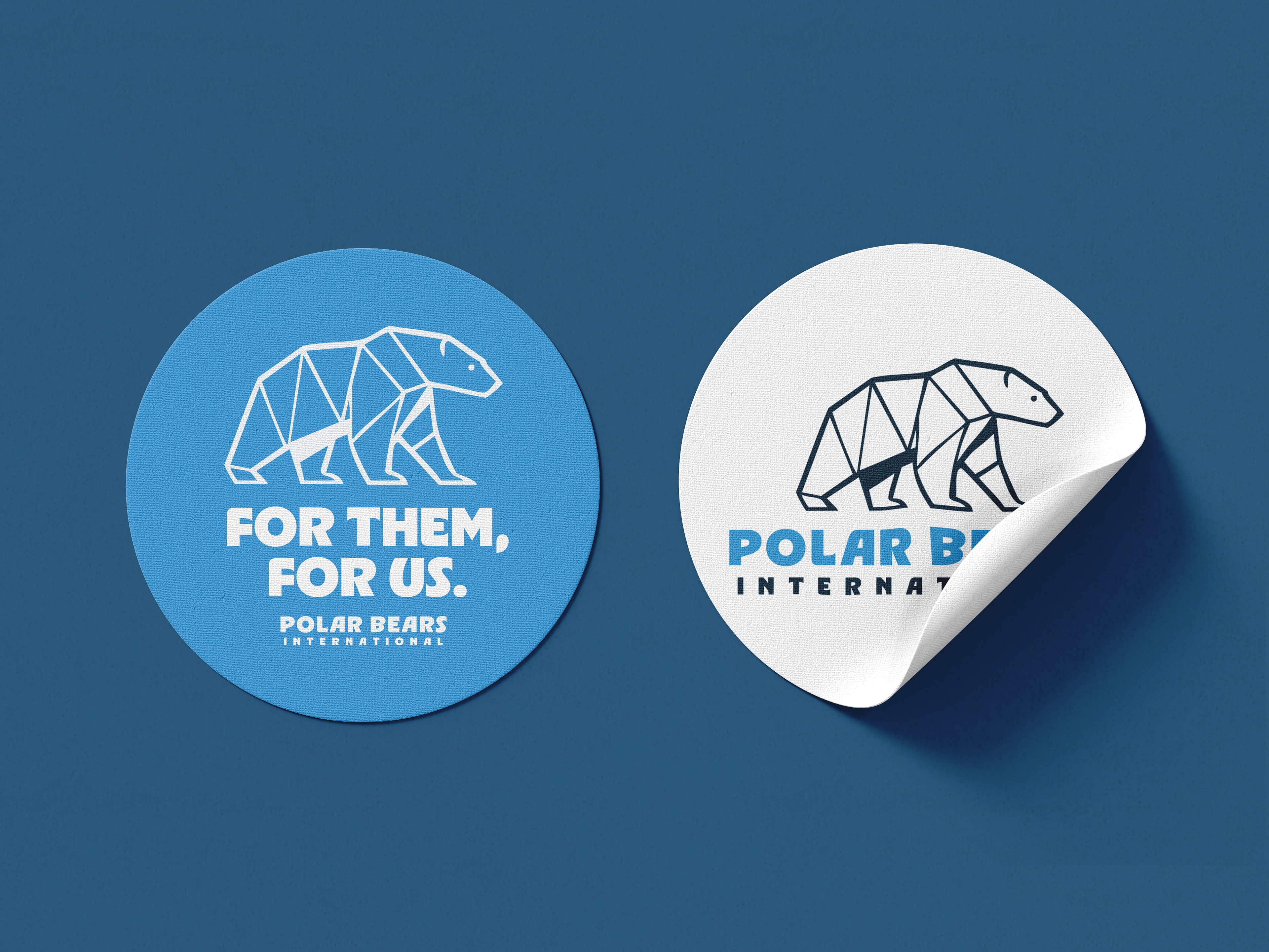
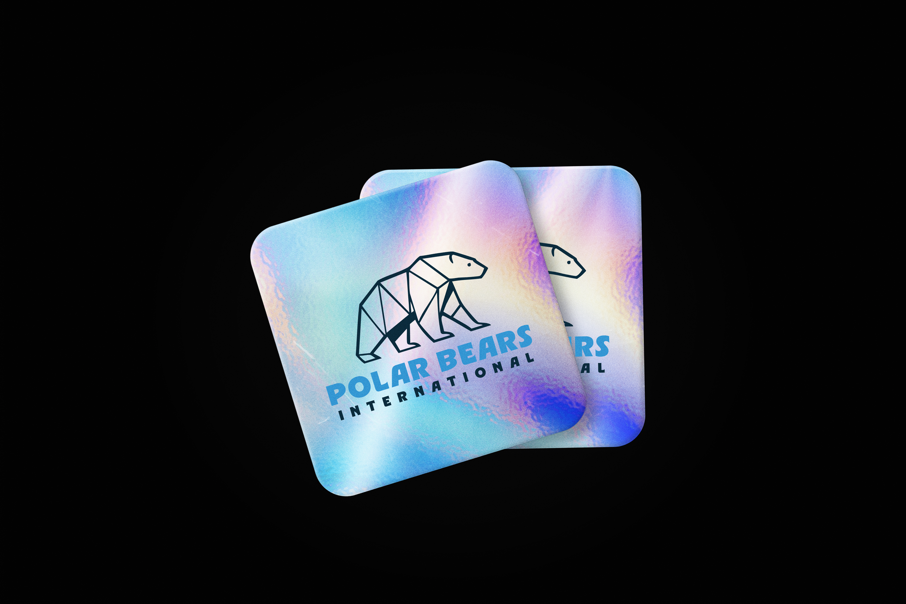
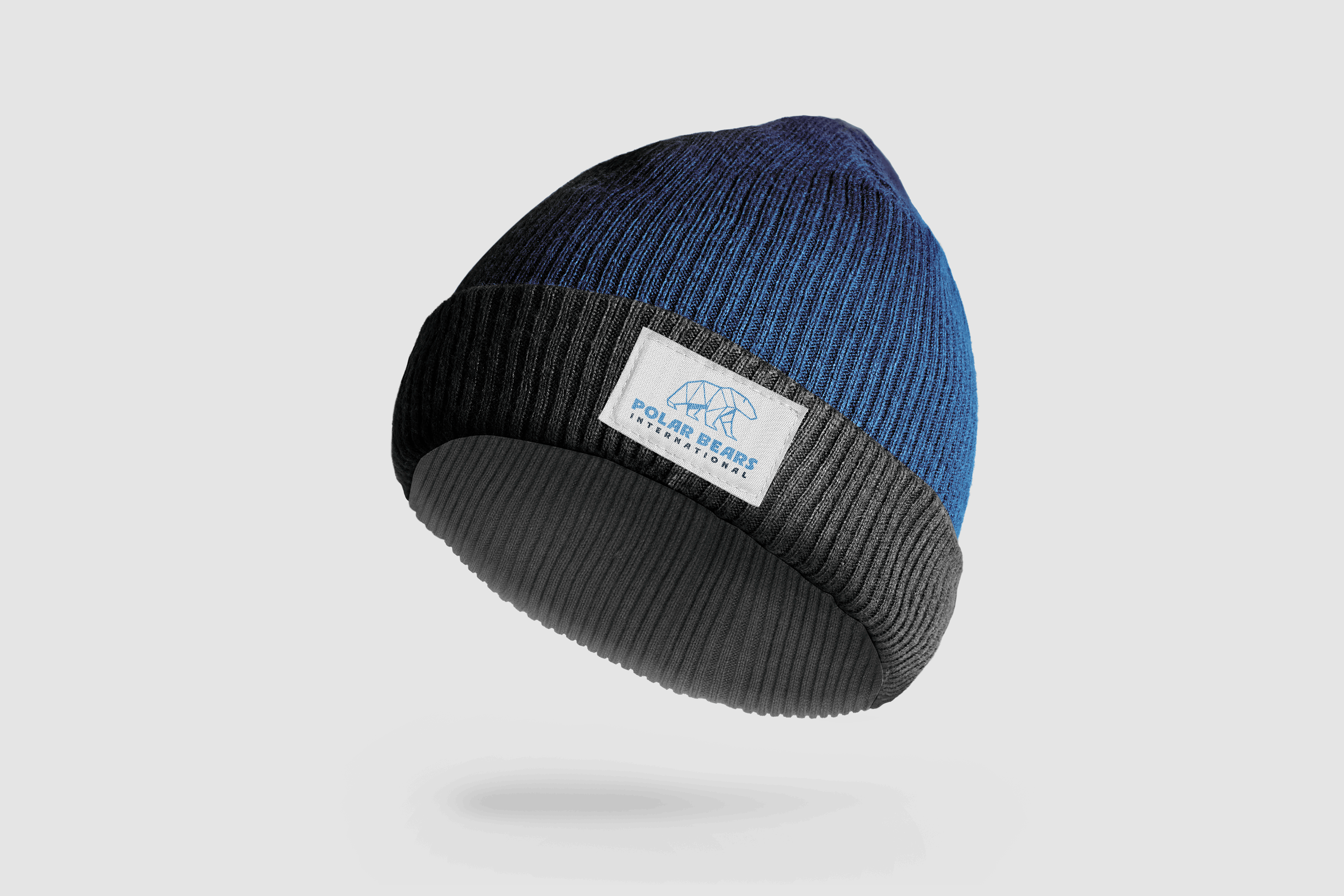
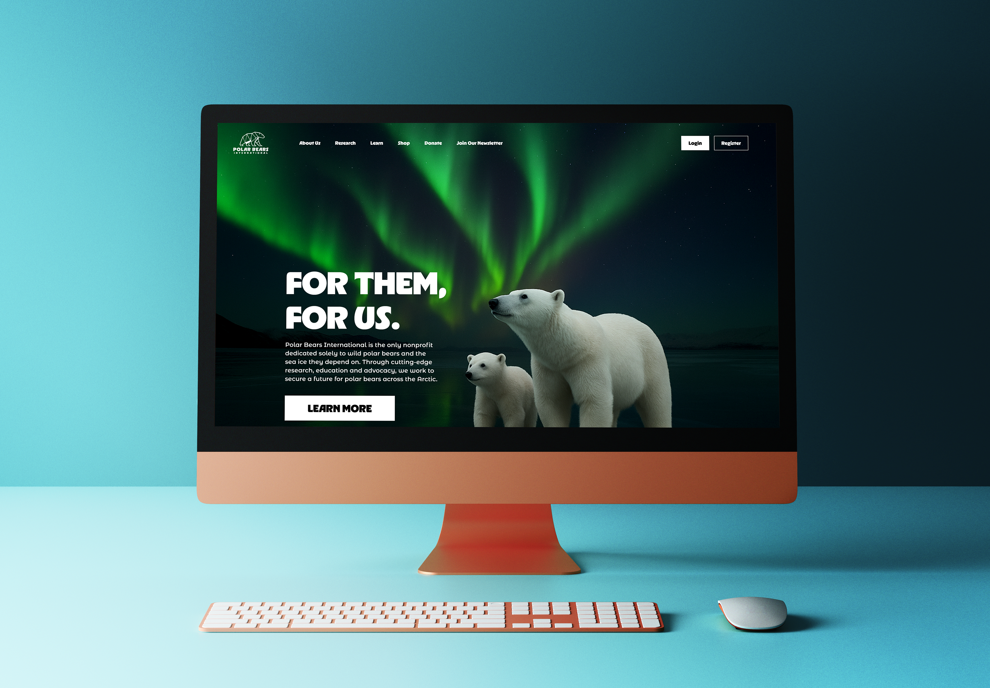
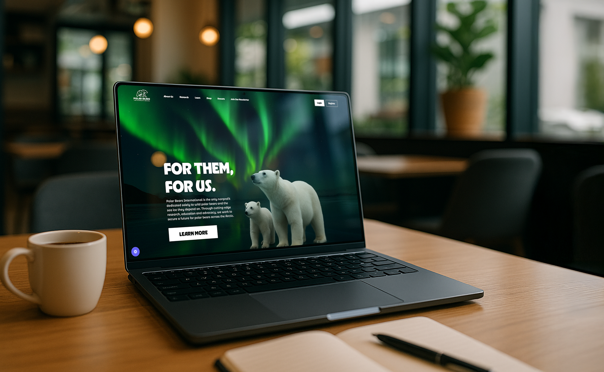
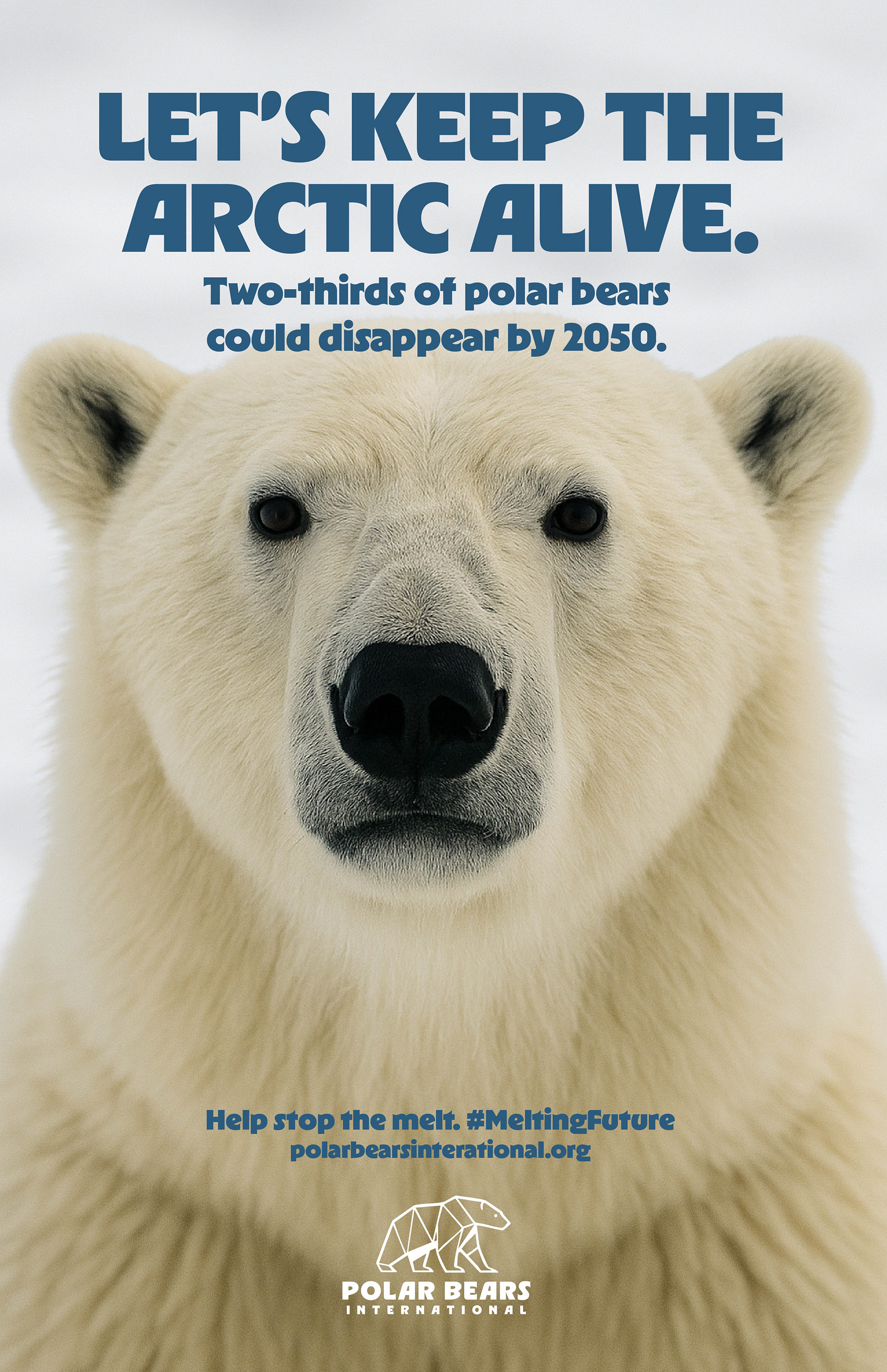
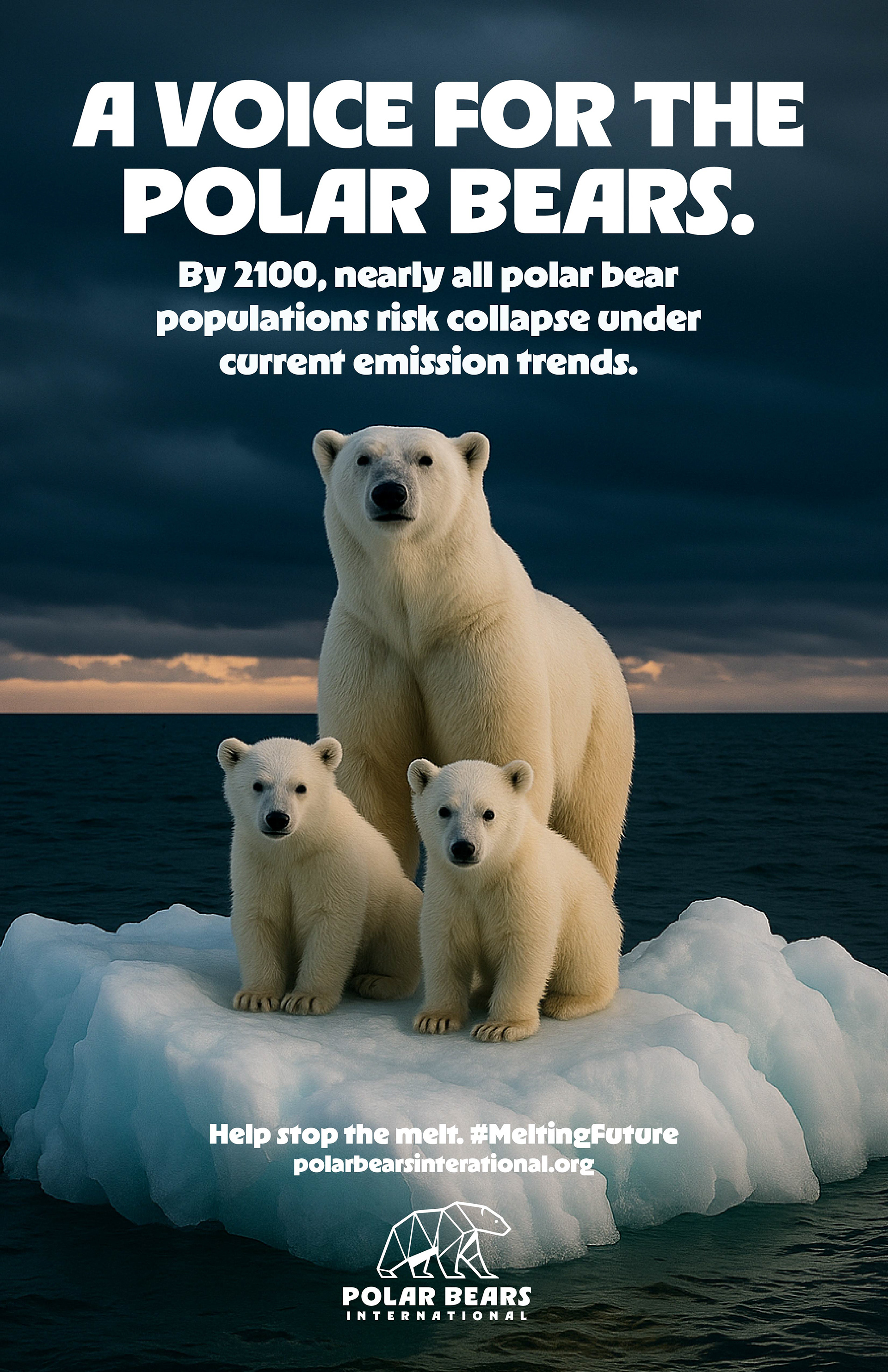
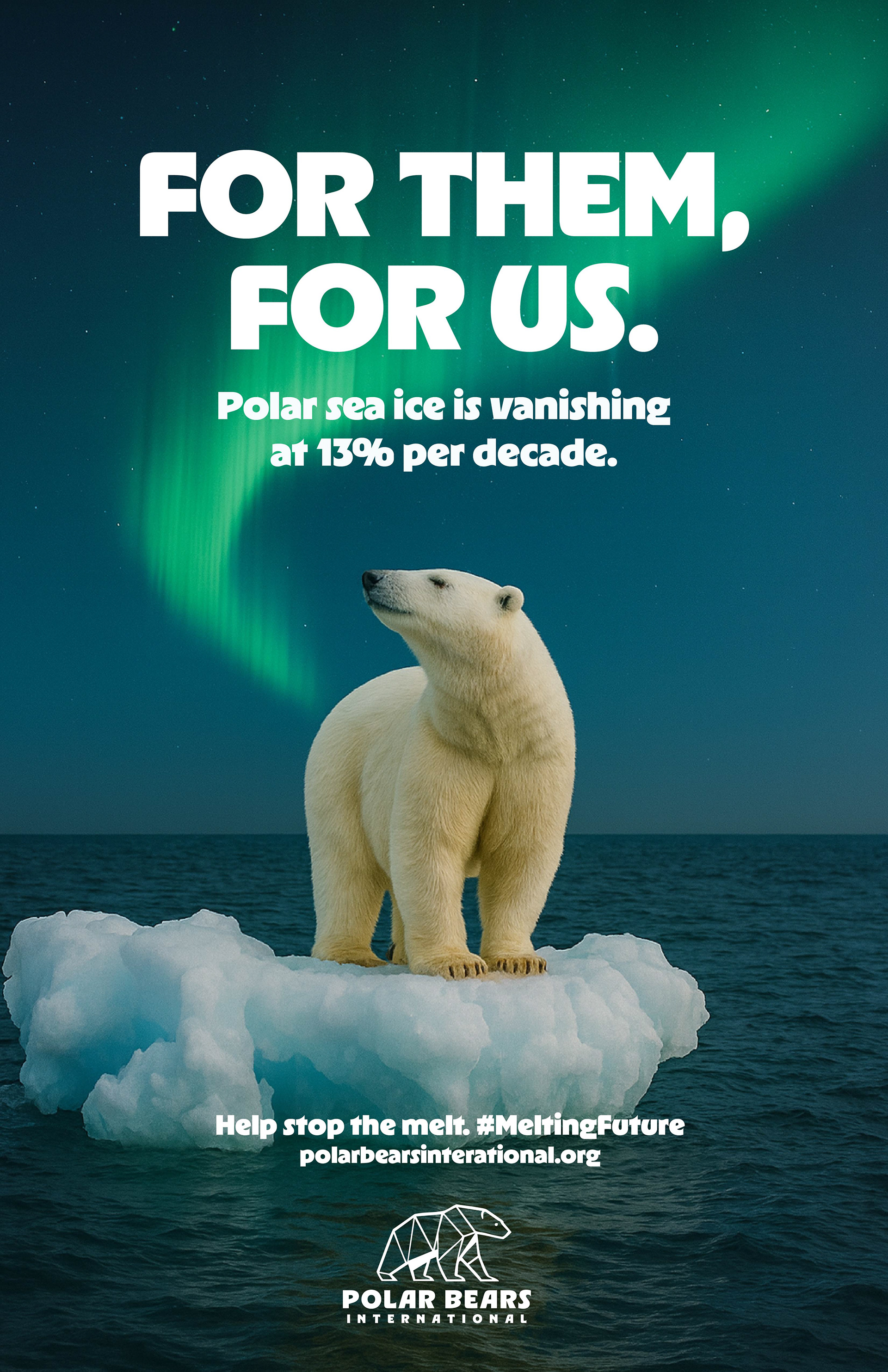
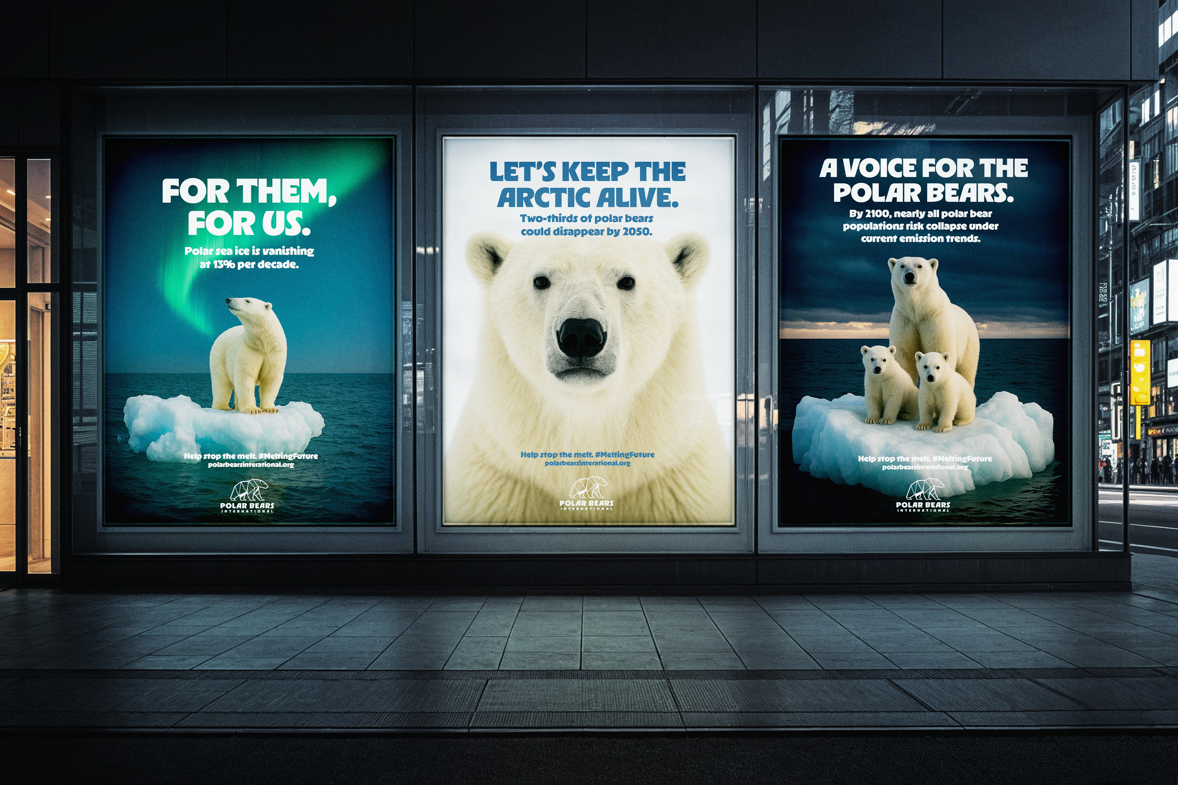
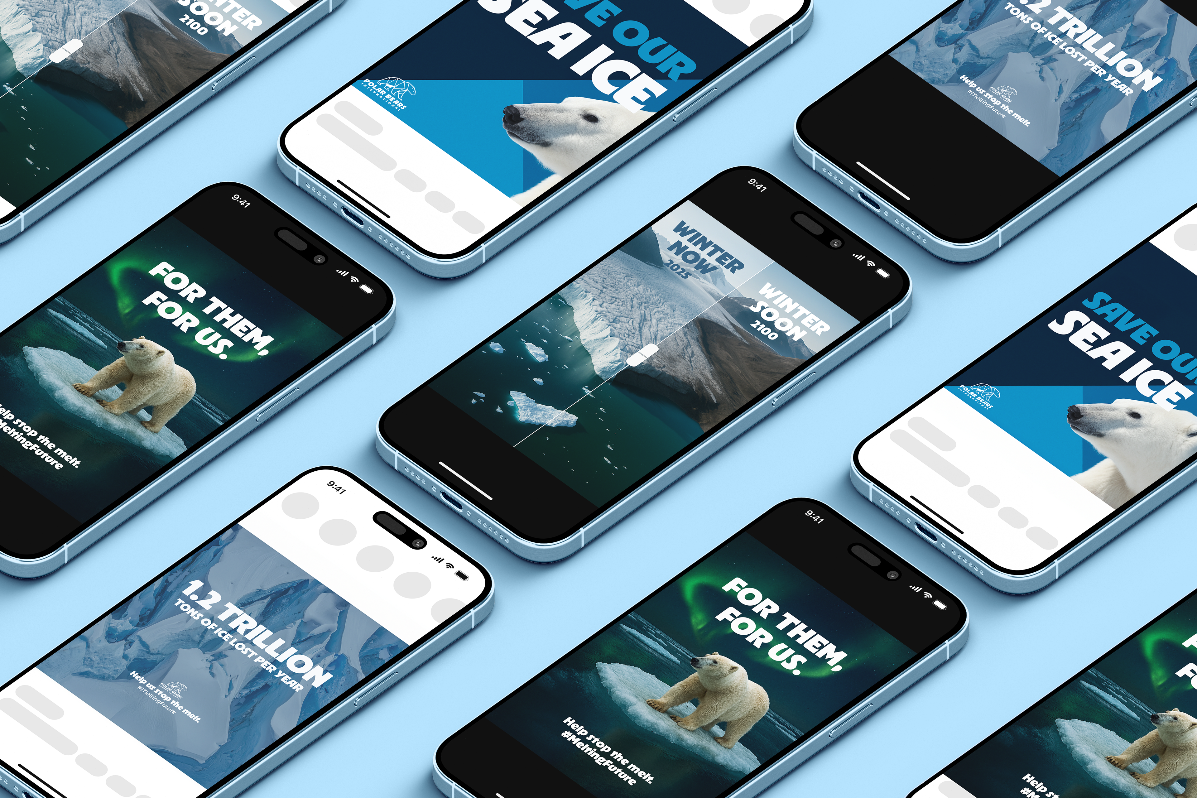
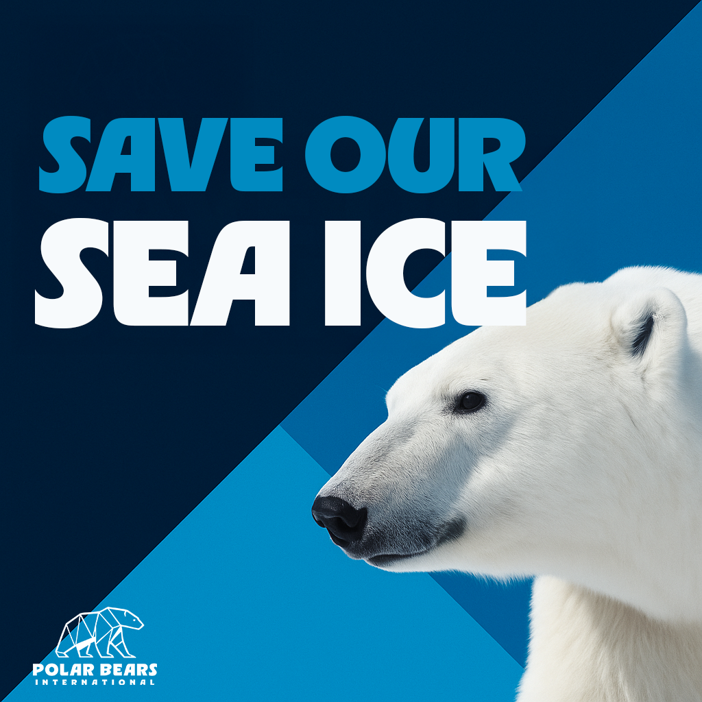
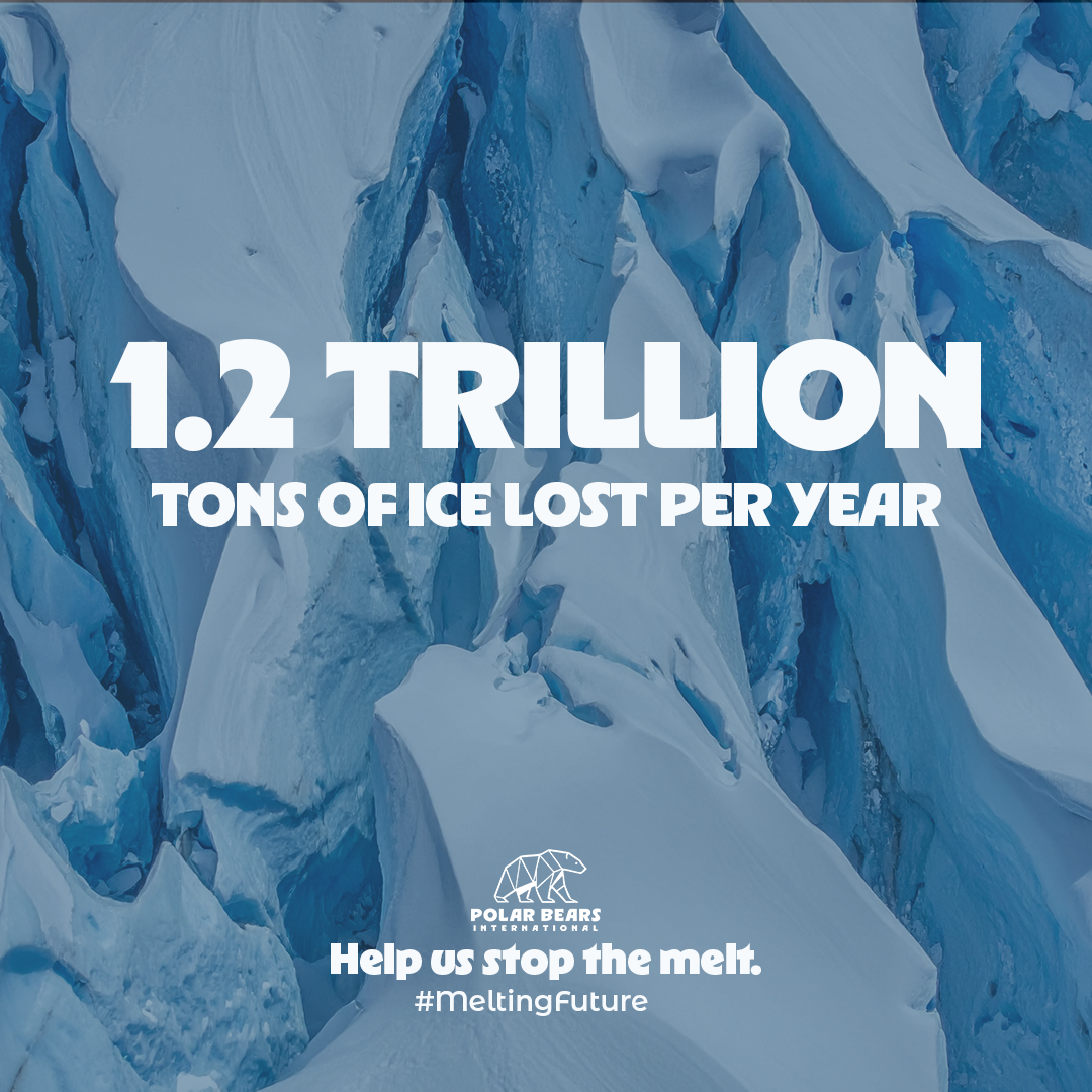
Reimagined the identity of Polar Bears International, blending geometric designs and bold, arctic-inspired visuals. The rebrand includes an updated logo of a polar bear inspired by shards of sea ice, a full brand package outlining the refreshed identity system, and brand extensions and merch – all crafted to capture the urgency of climate change with a modern voice.
Spec Work
Challenge
Environmental organizations must communicate urgent global issues while inspiring hope, action, and public trust. My challenge was to develop and evolve a refreshed identity for Polar Bears International that could increase visibility, strengthen recognition, and communicate the organization's conservation mission through a contemporary and adaptable visual system.
Approach
The rebrand draws inspiration from the Arctic landscape itself, translating fractured sea ice into a bold geometric visual language that reflects both the beauty and fragility of polar ecosystems. A simplified polar bear mark serves as the centerpiece of the identity, balancing approachability with strength while reinforcing instant brand recognition.
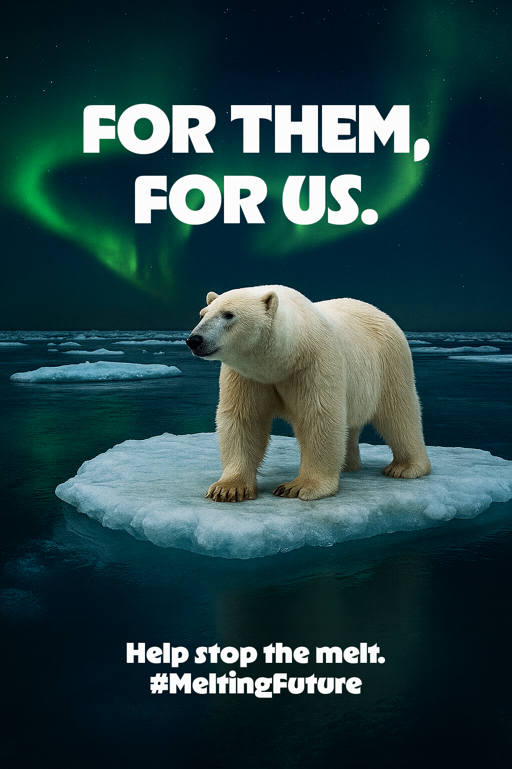
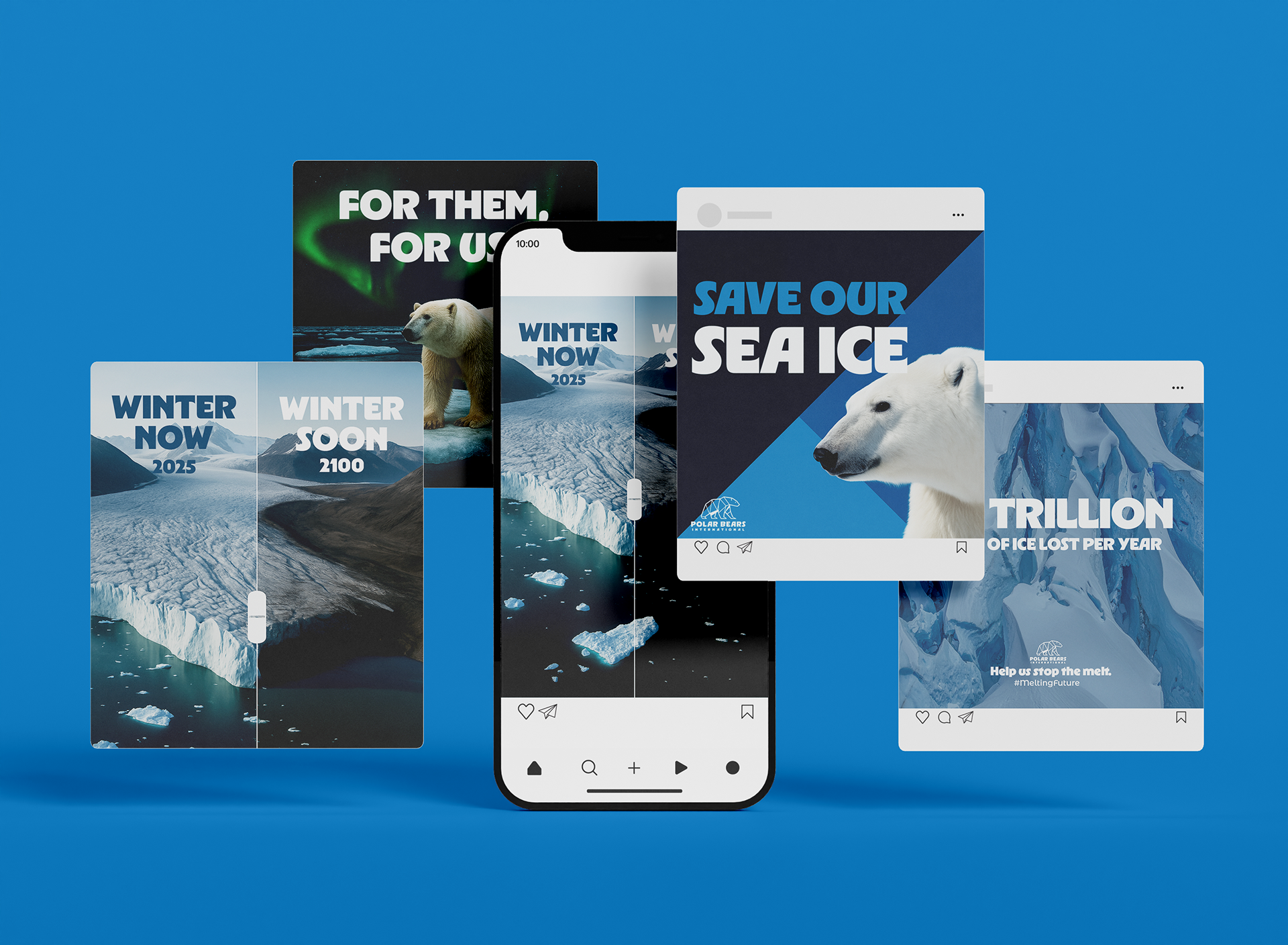
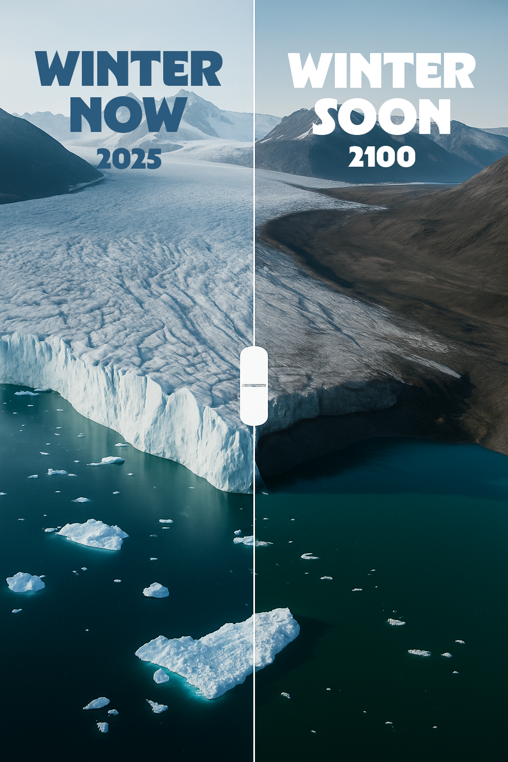
Designed for flexibility across digital, print, educational, and environmental applications, the system pairs confident typography with a restrained Arctic-inspired color palette to communicate clarity, credibility, and urgency without relying on fear-based messaging.
Outcome
The result is a cohesive identity system that modernizes Polar Bears International's visual presence while remaining grounded in its conservation mission. From brand guidelines to merchandise and campaign applications, the refreshed system creates a recognizable and adaptable framework that supports education, advocacy, and public engagement—helping the organization communicate one of today's most pressing environmental challenges with confidence and clarity.