
Typeface Design | Brand Identity | Package Design
Software: Adobe Illustrator | InDesign | Photoshop | Figma | Procreate | Pacdora
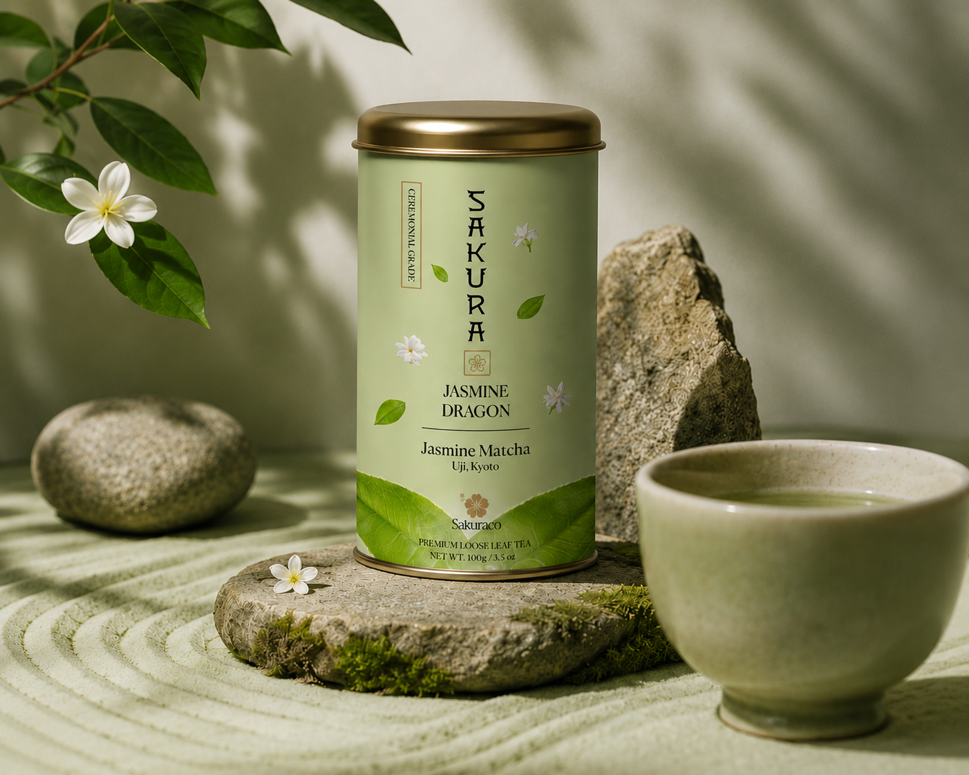
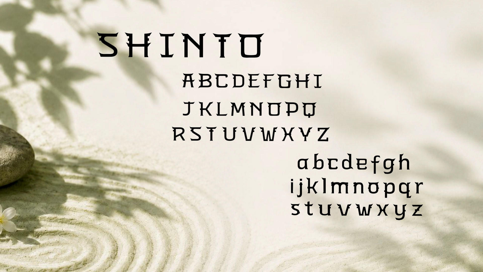
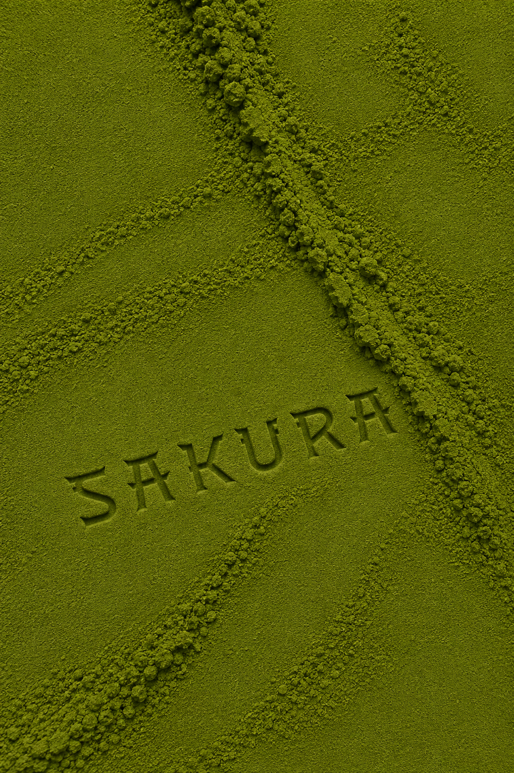
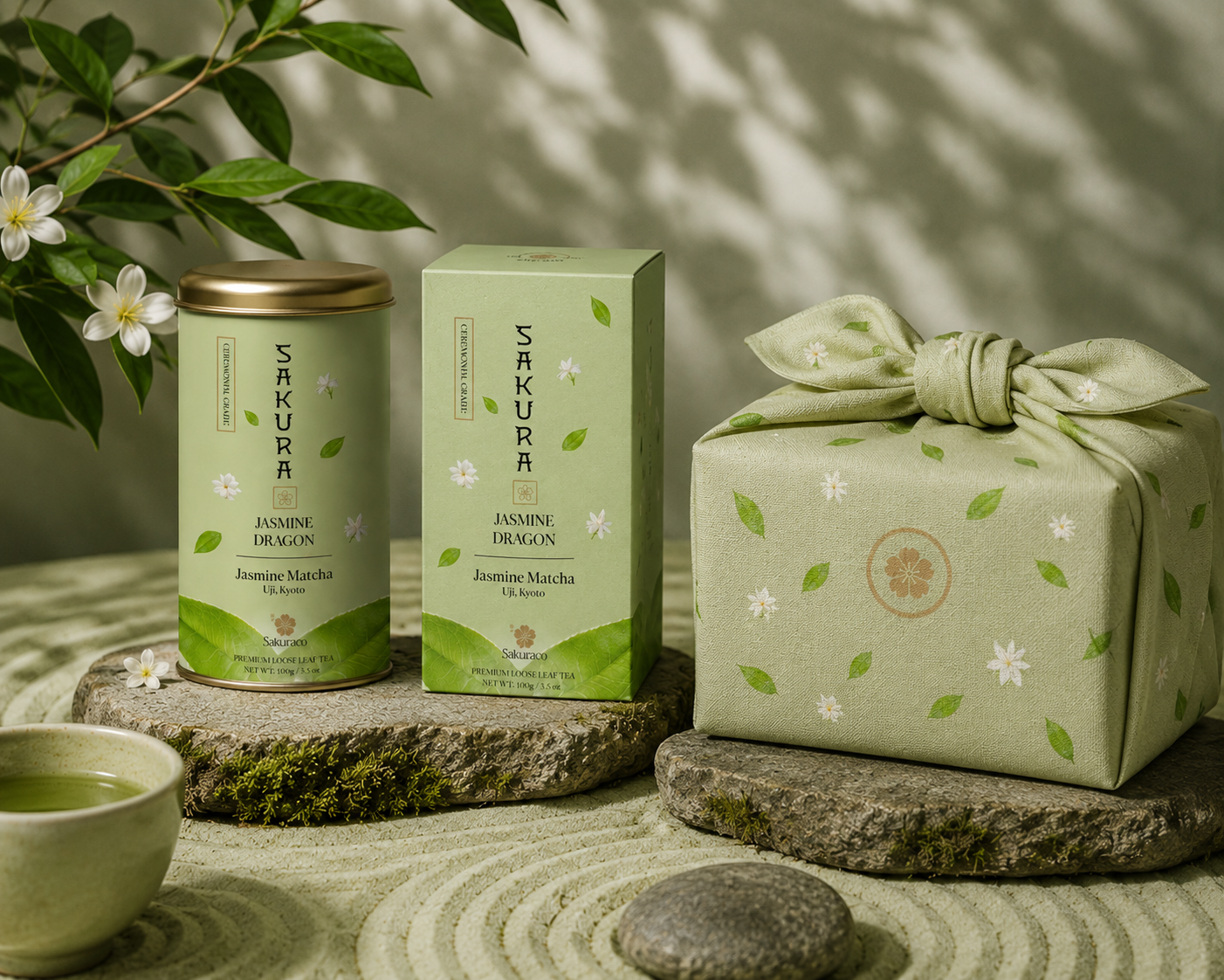
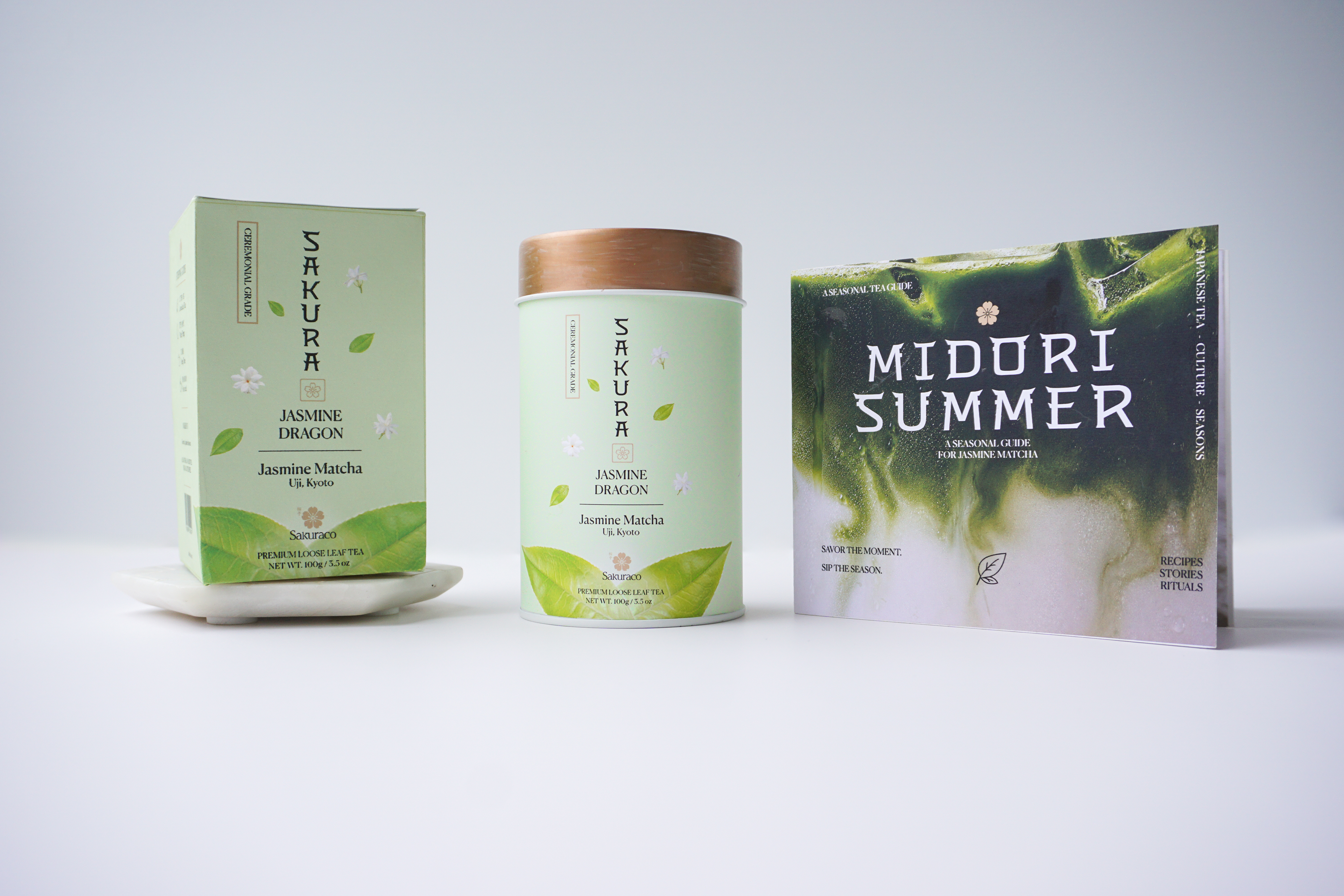
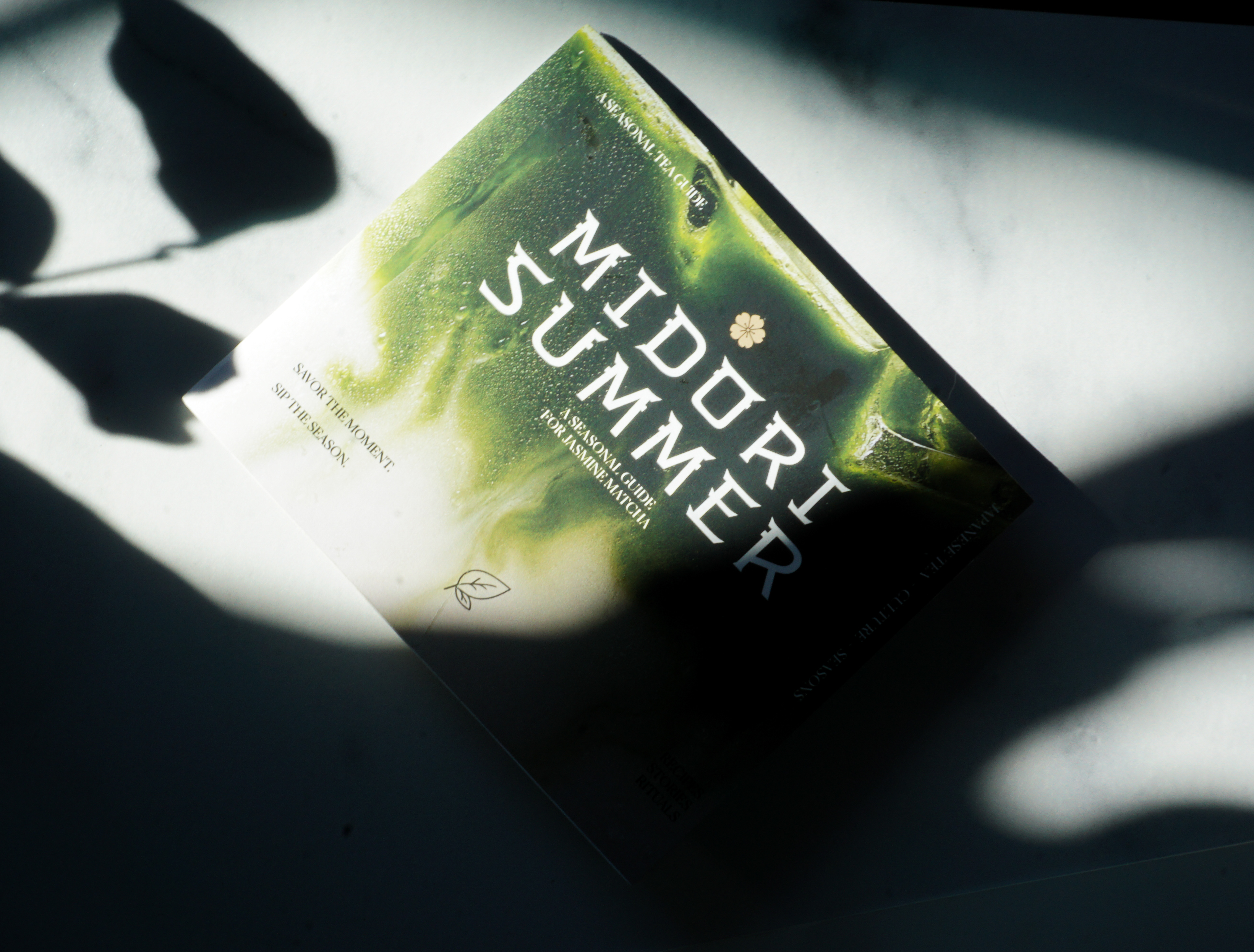
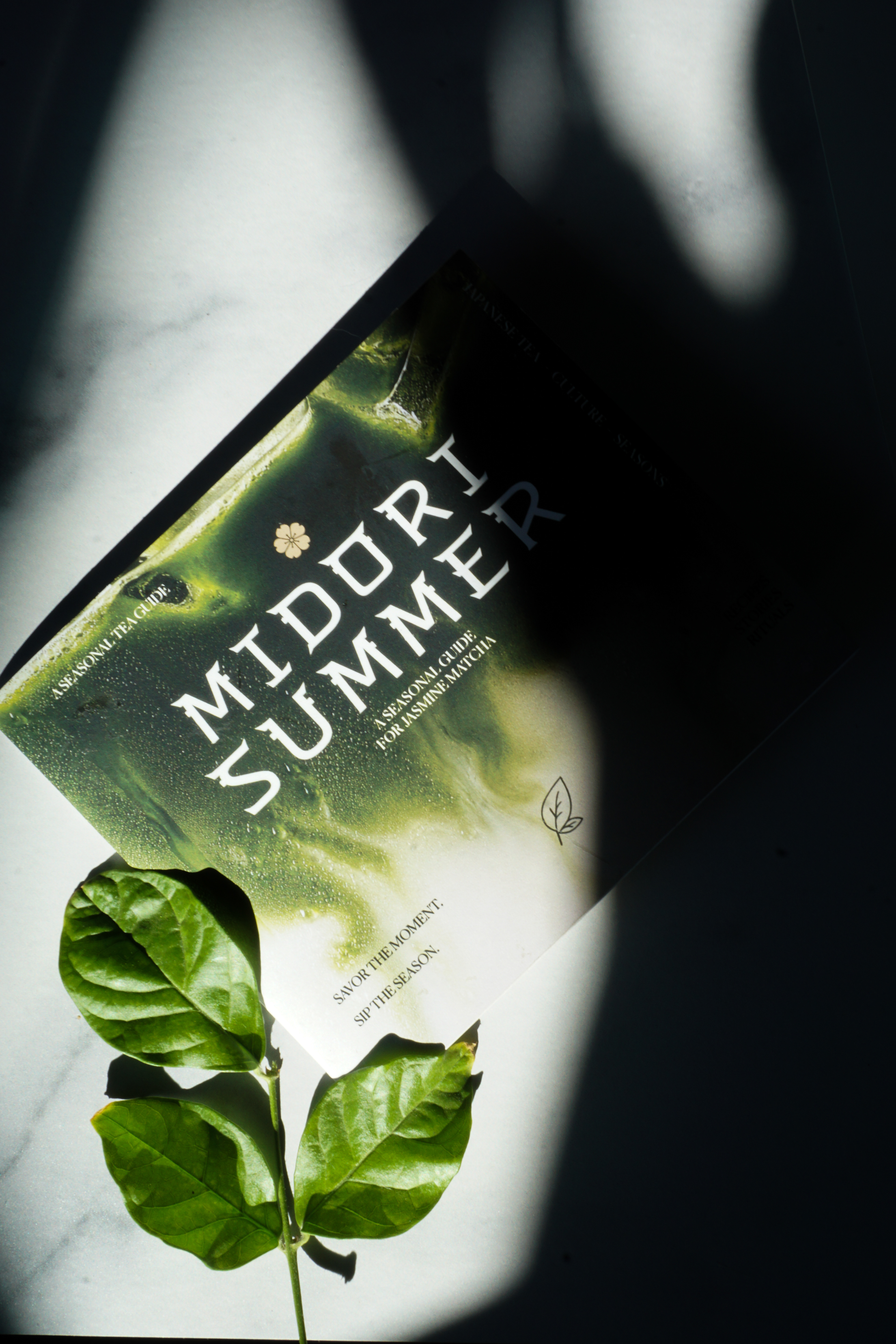
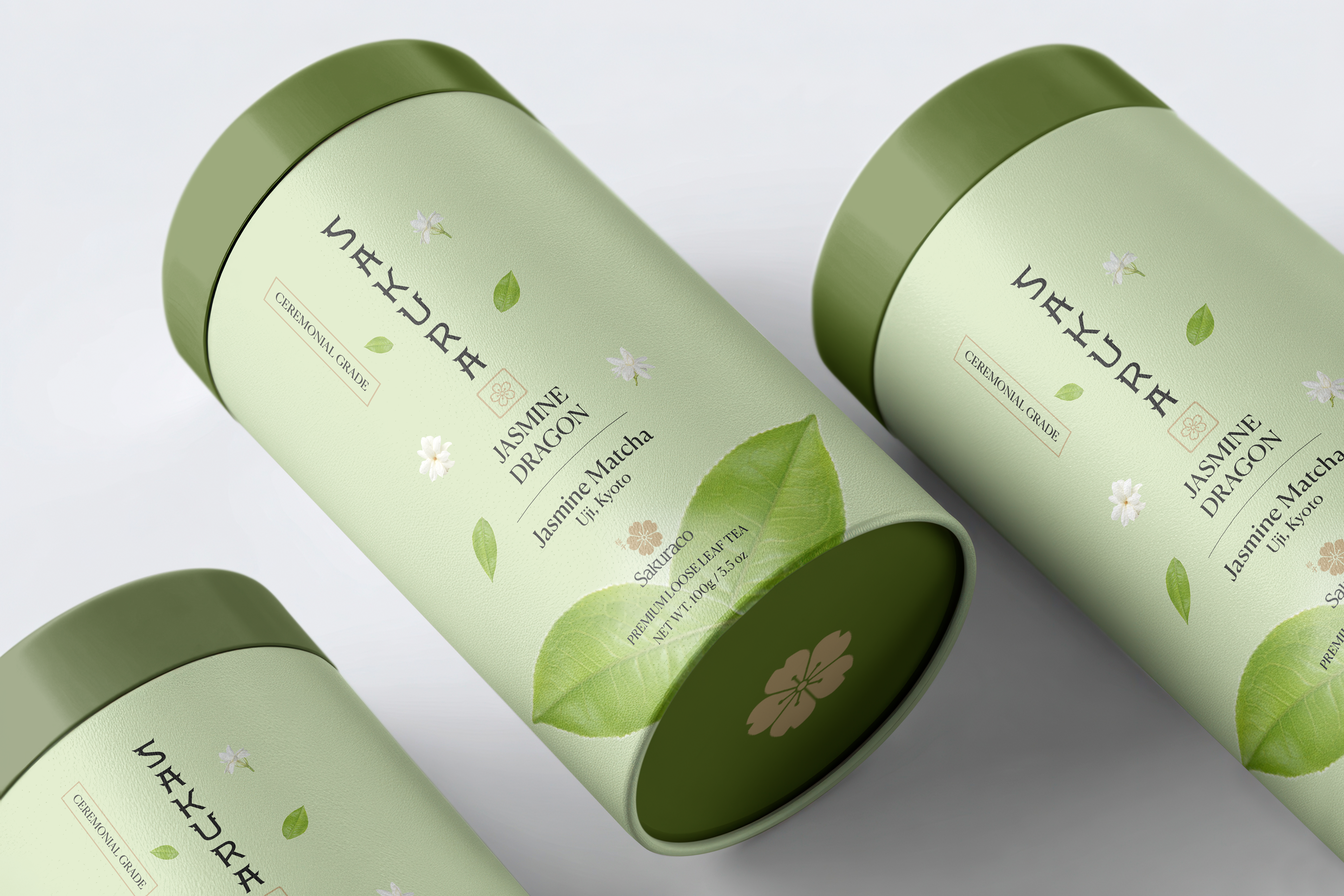
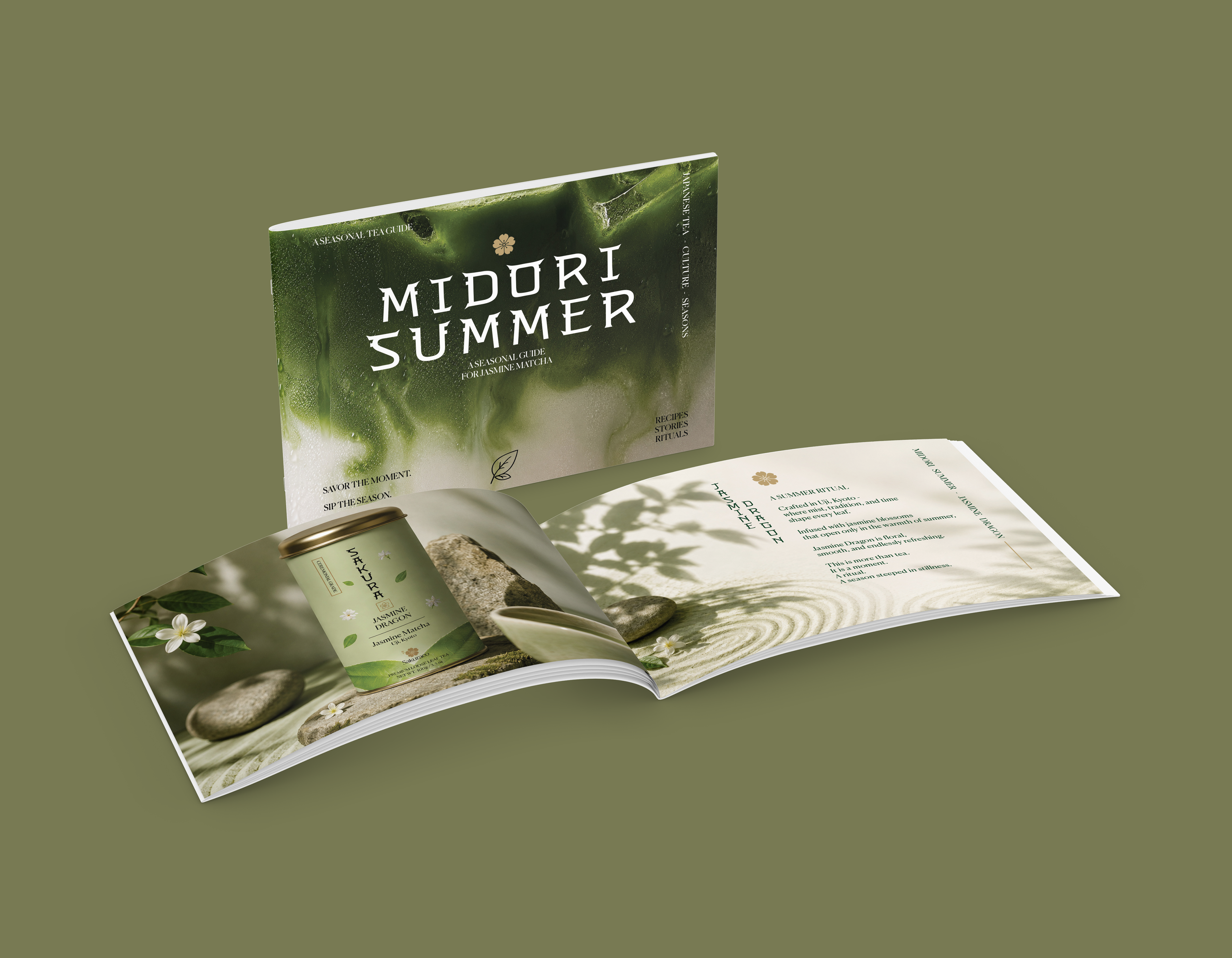
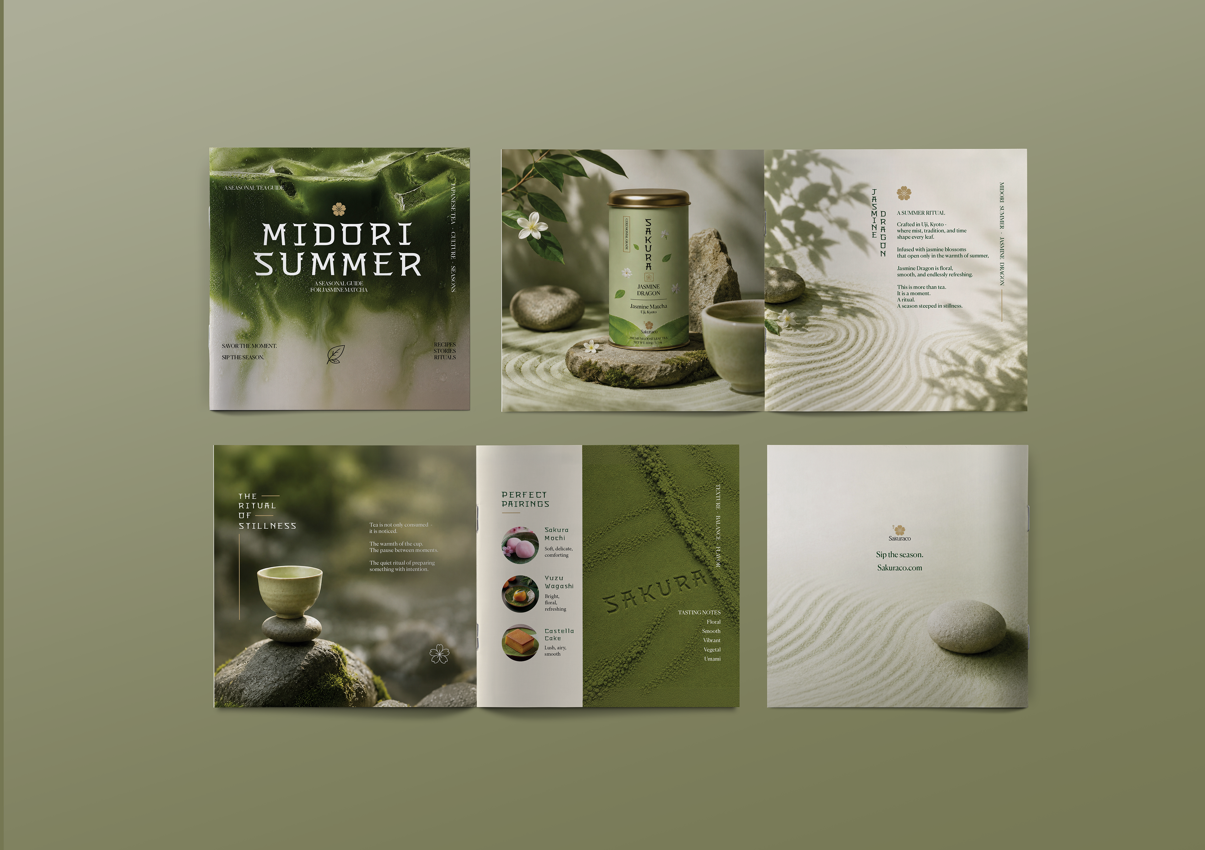
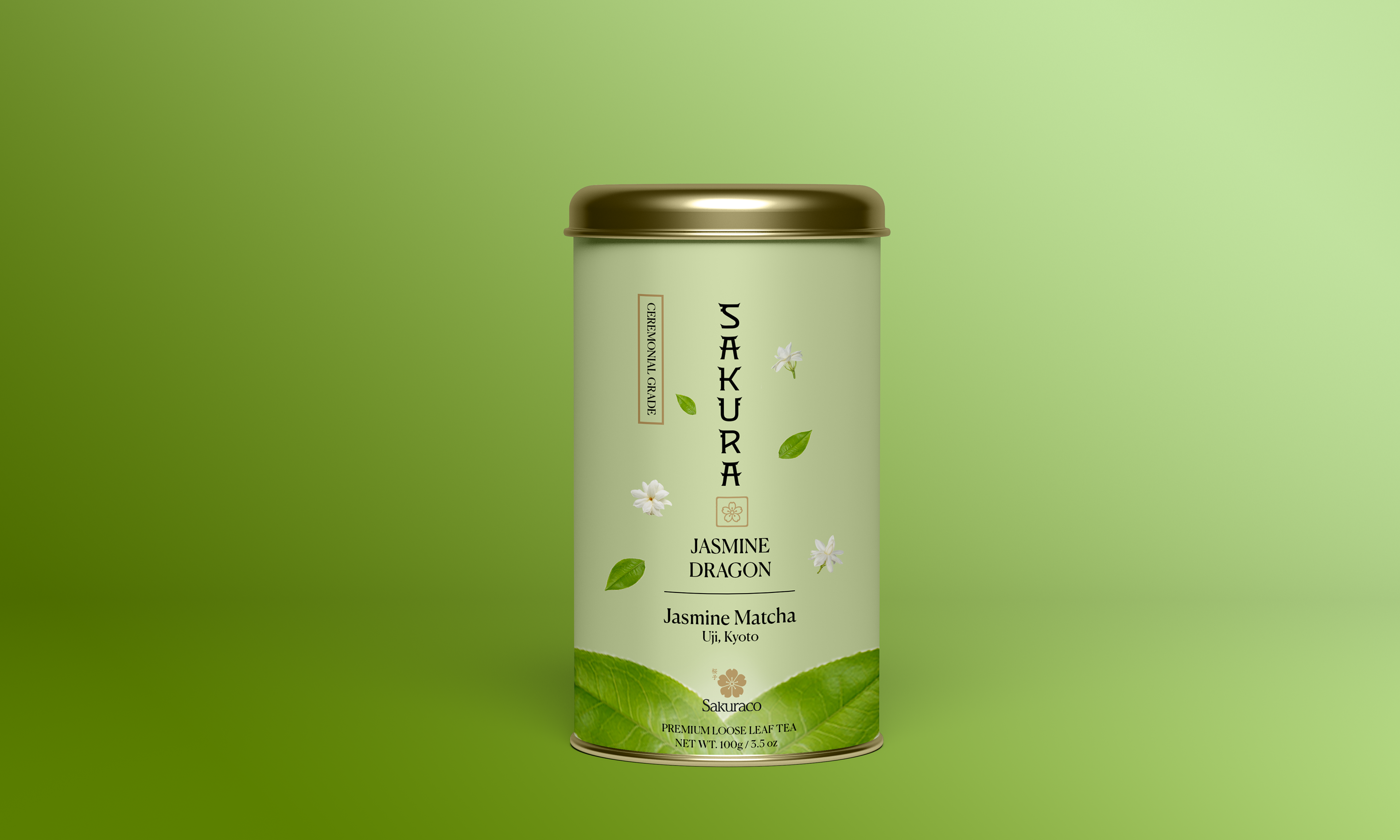
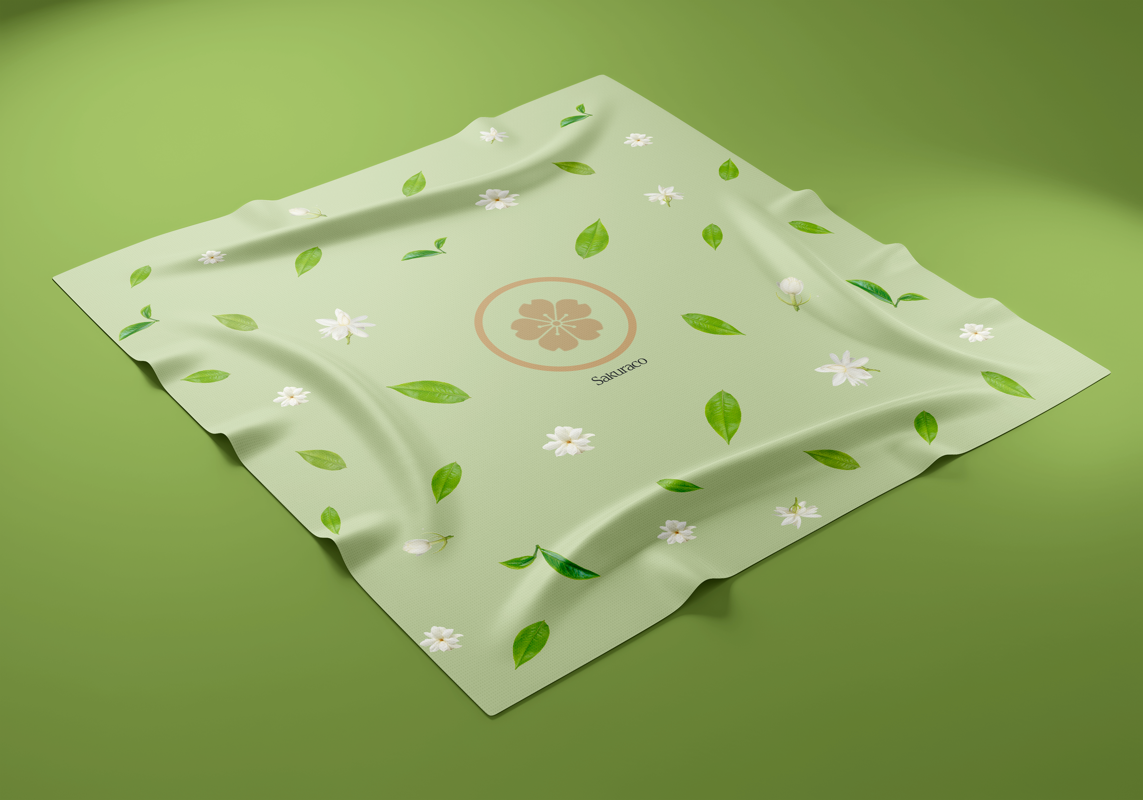
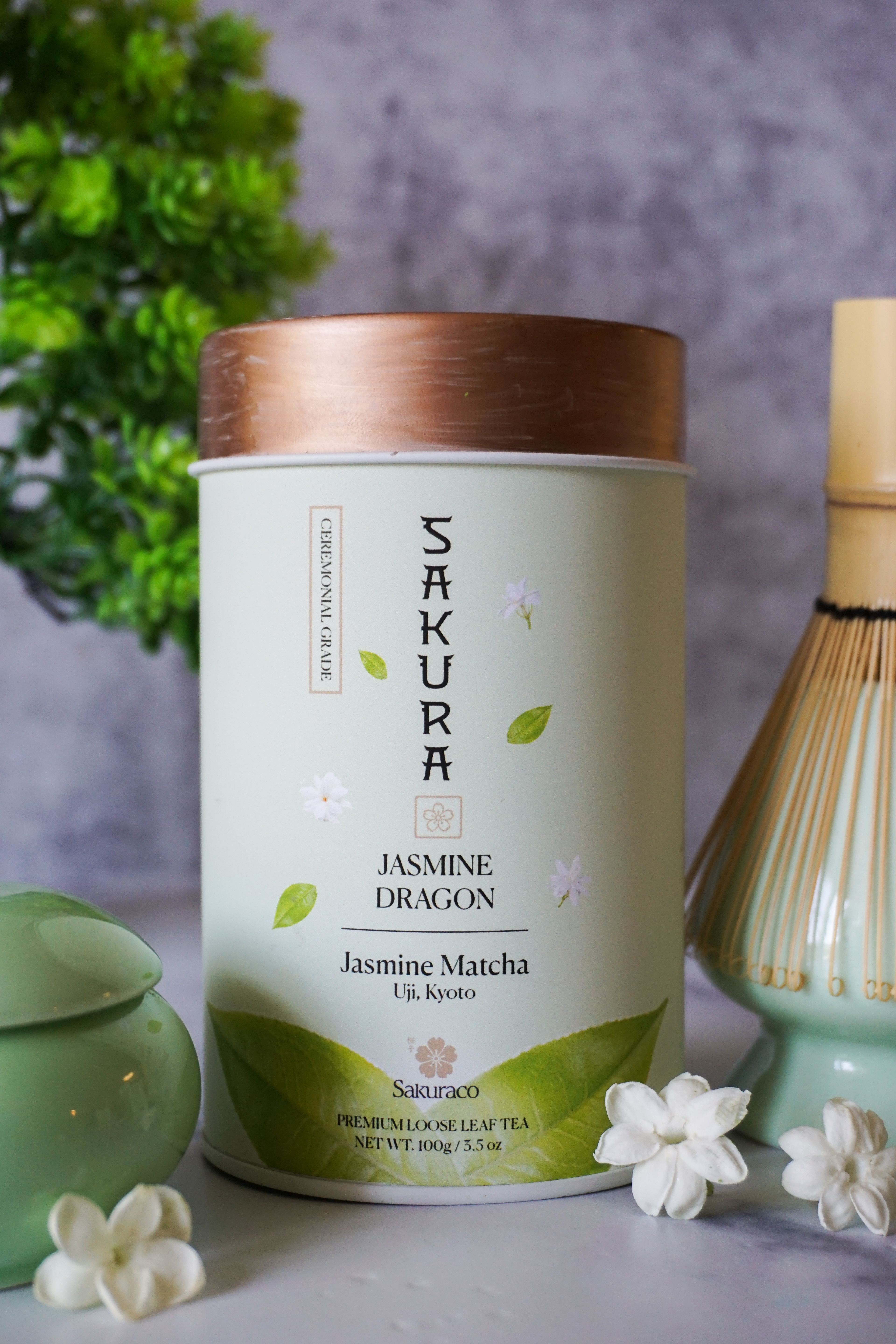
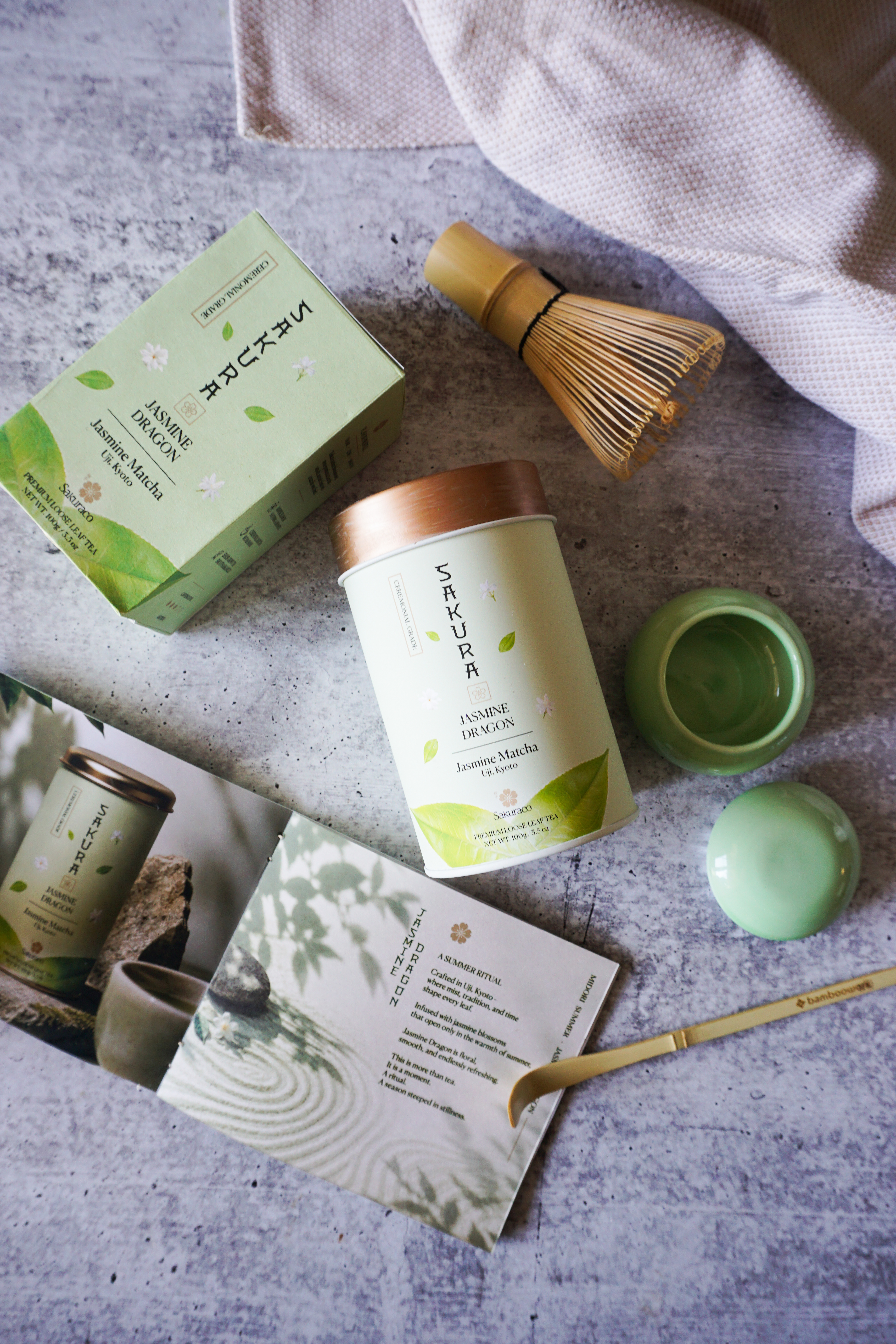
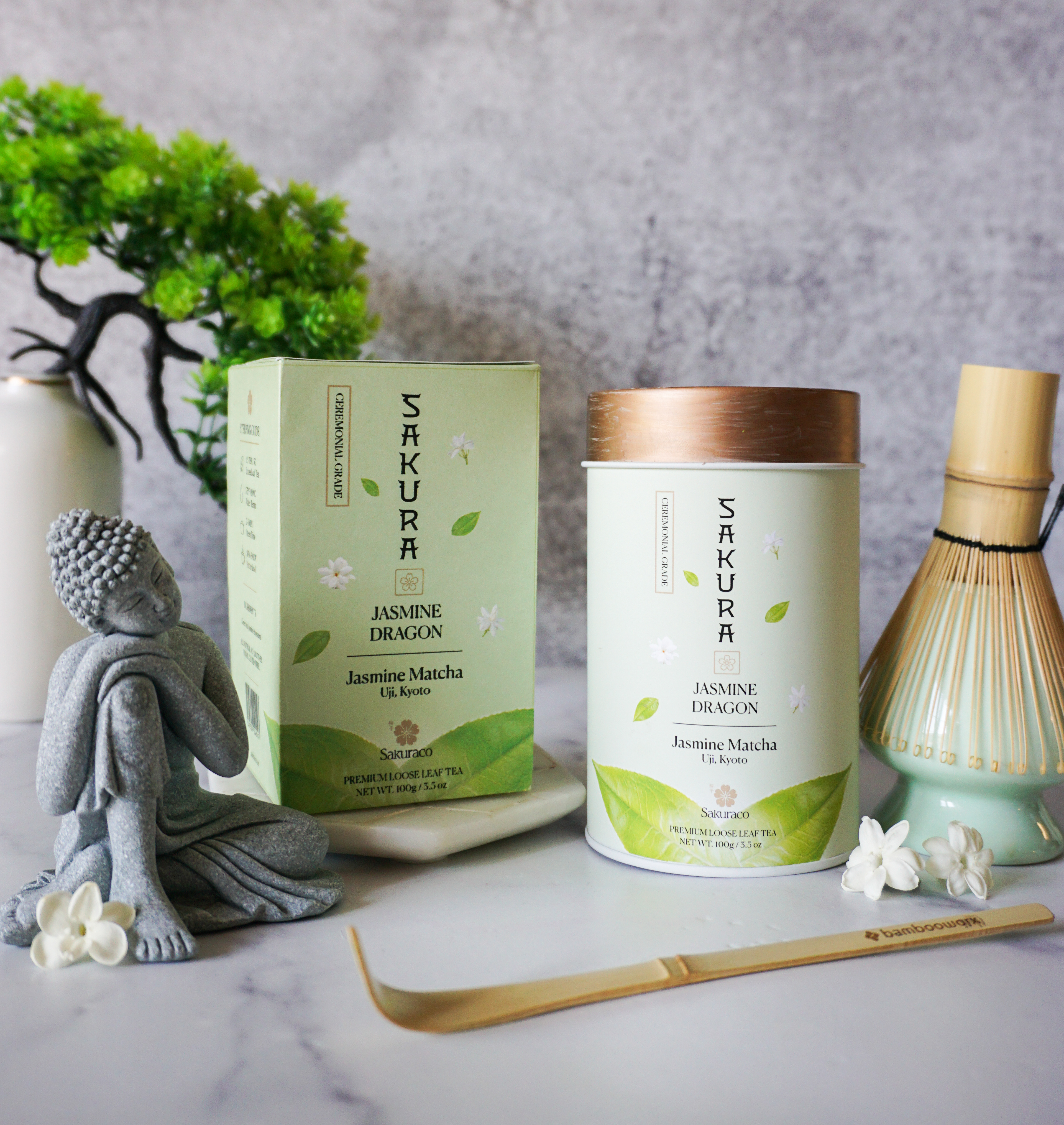
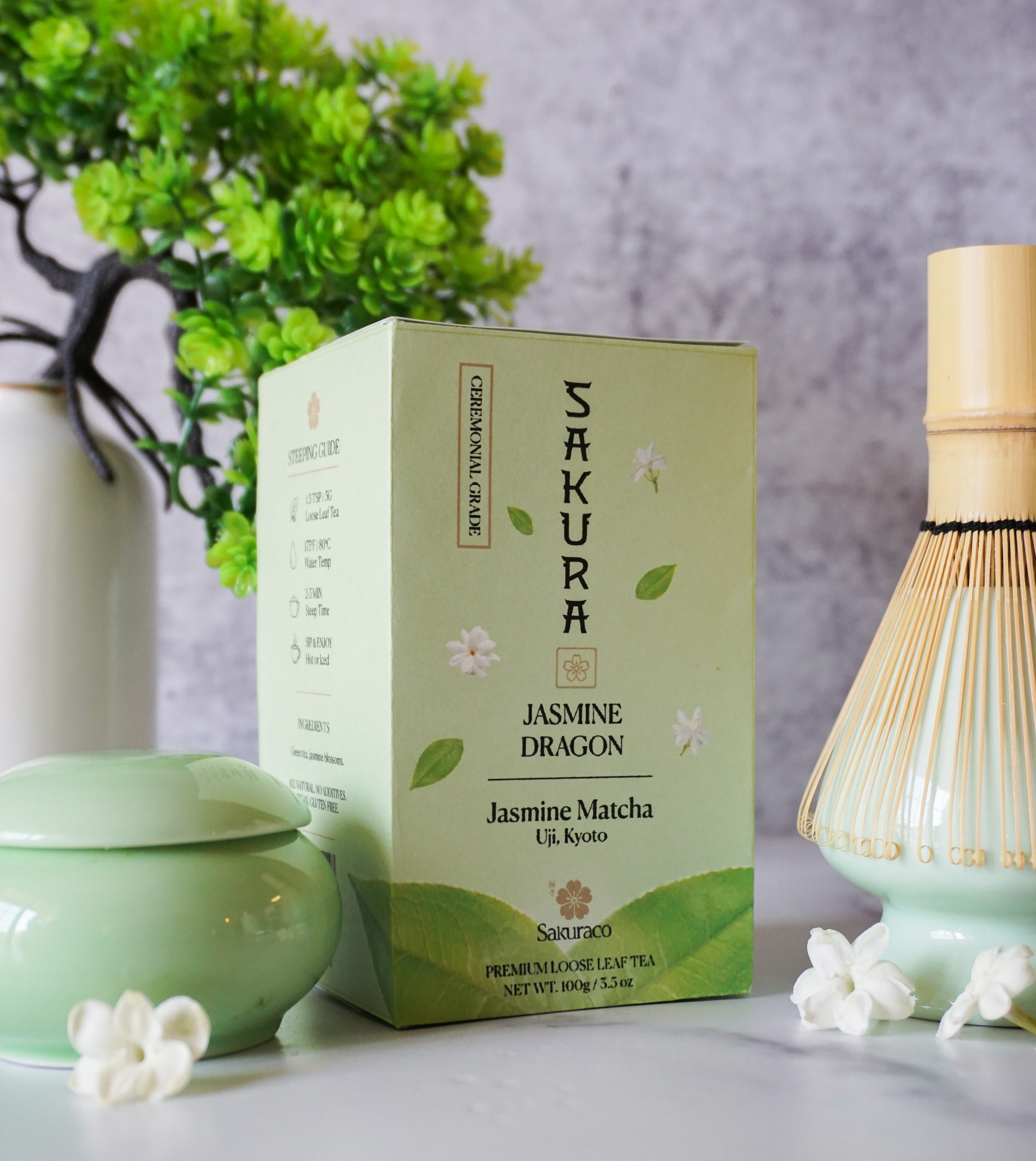
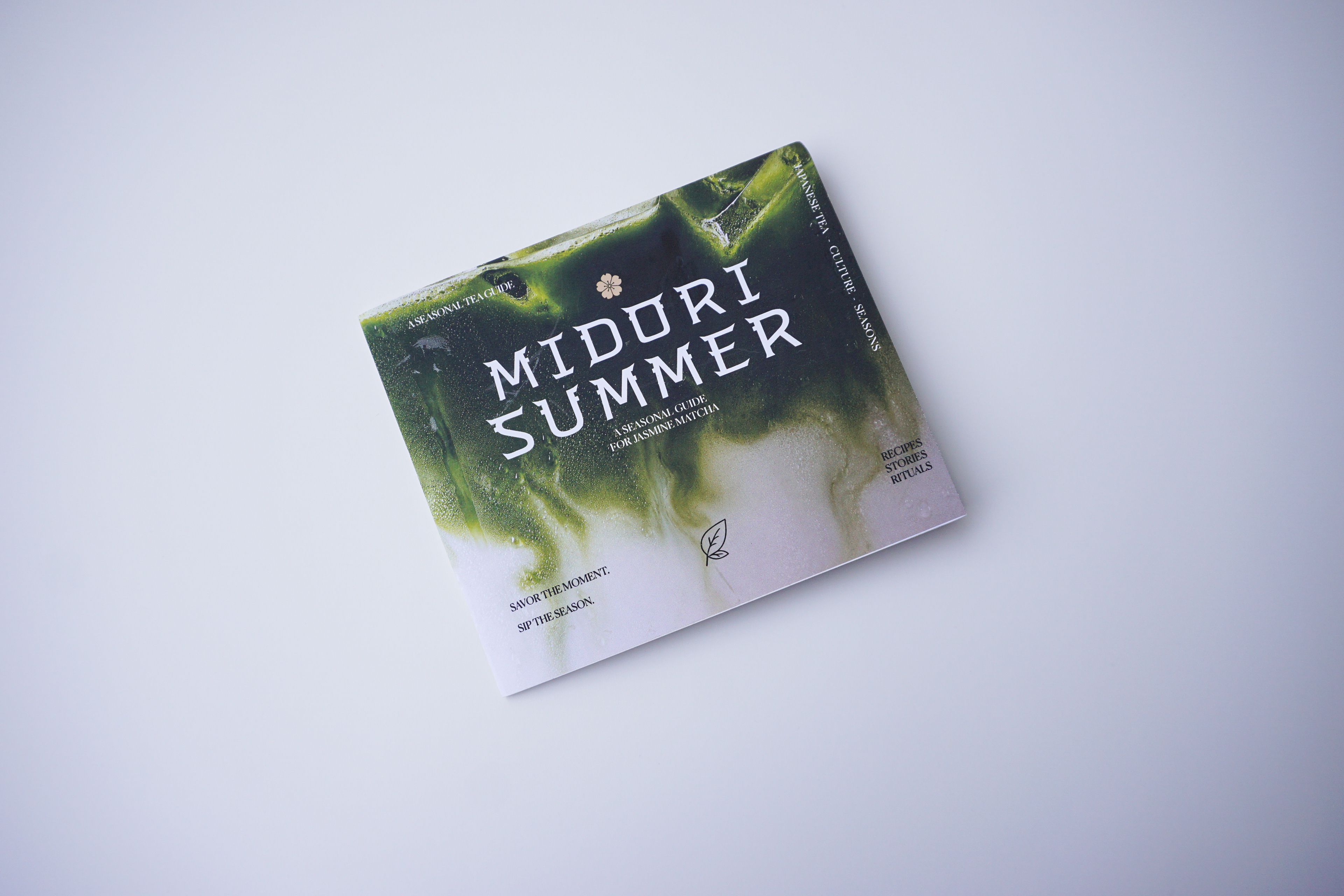
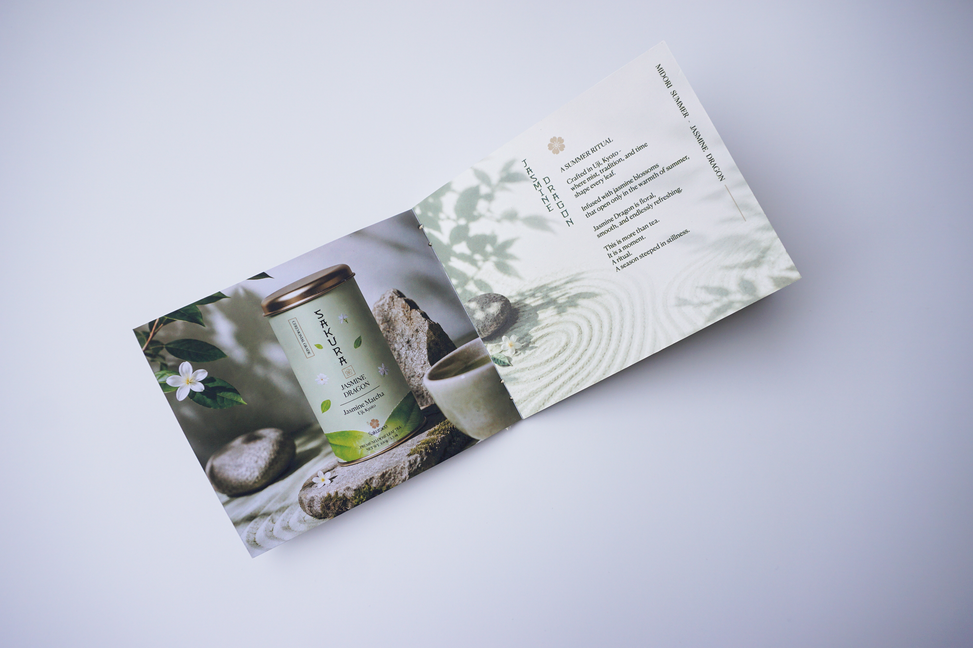
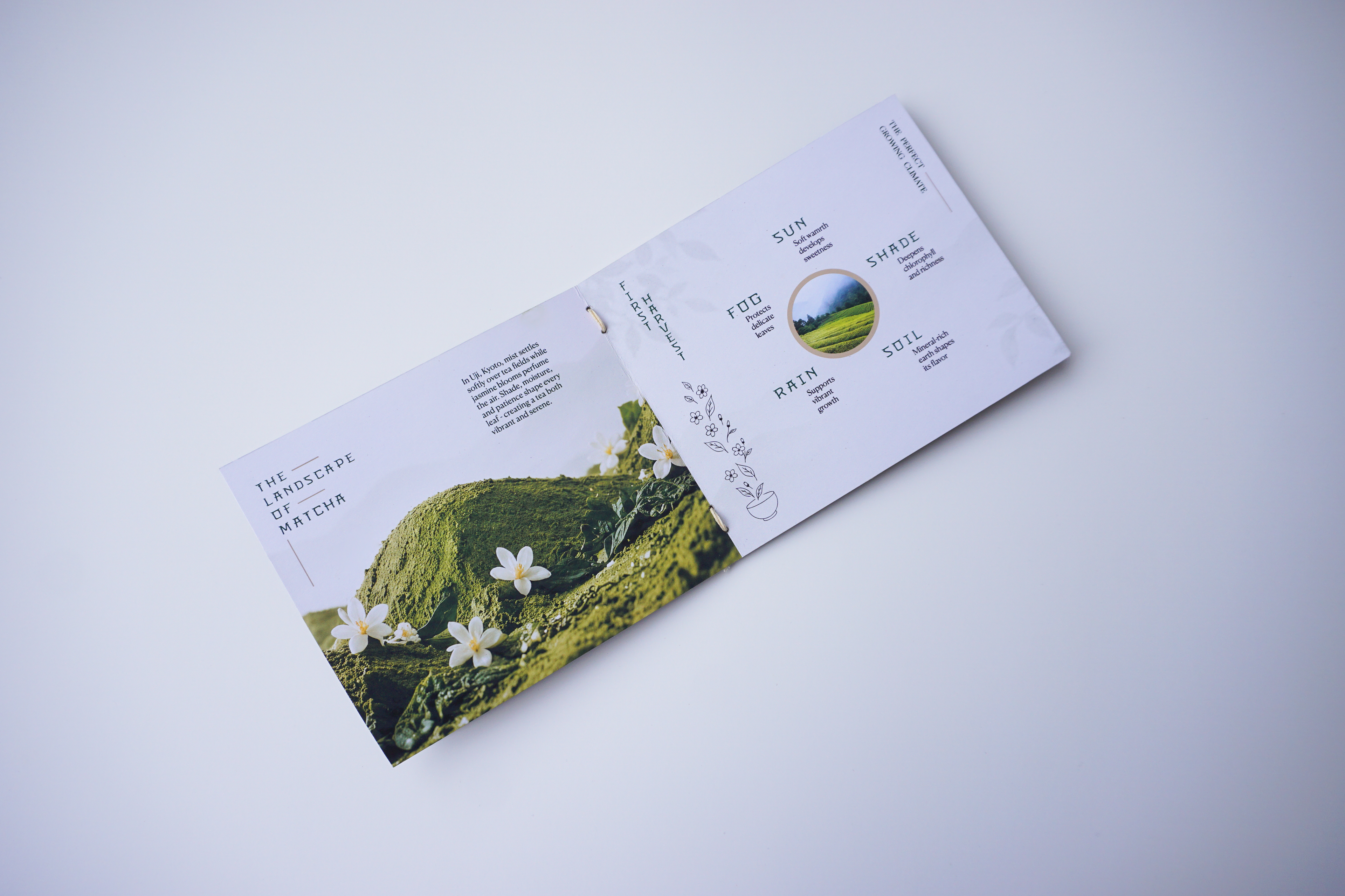
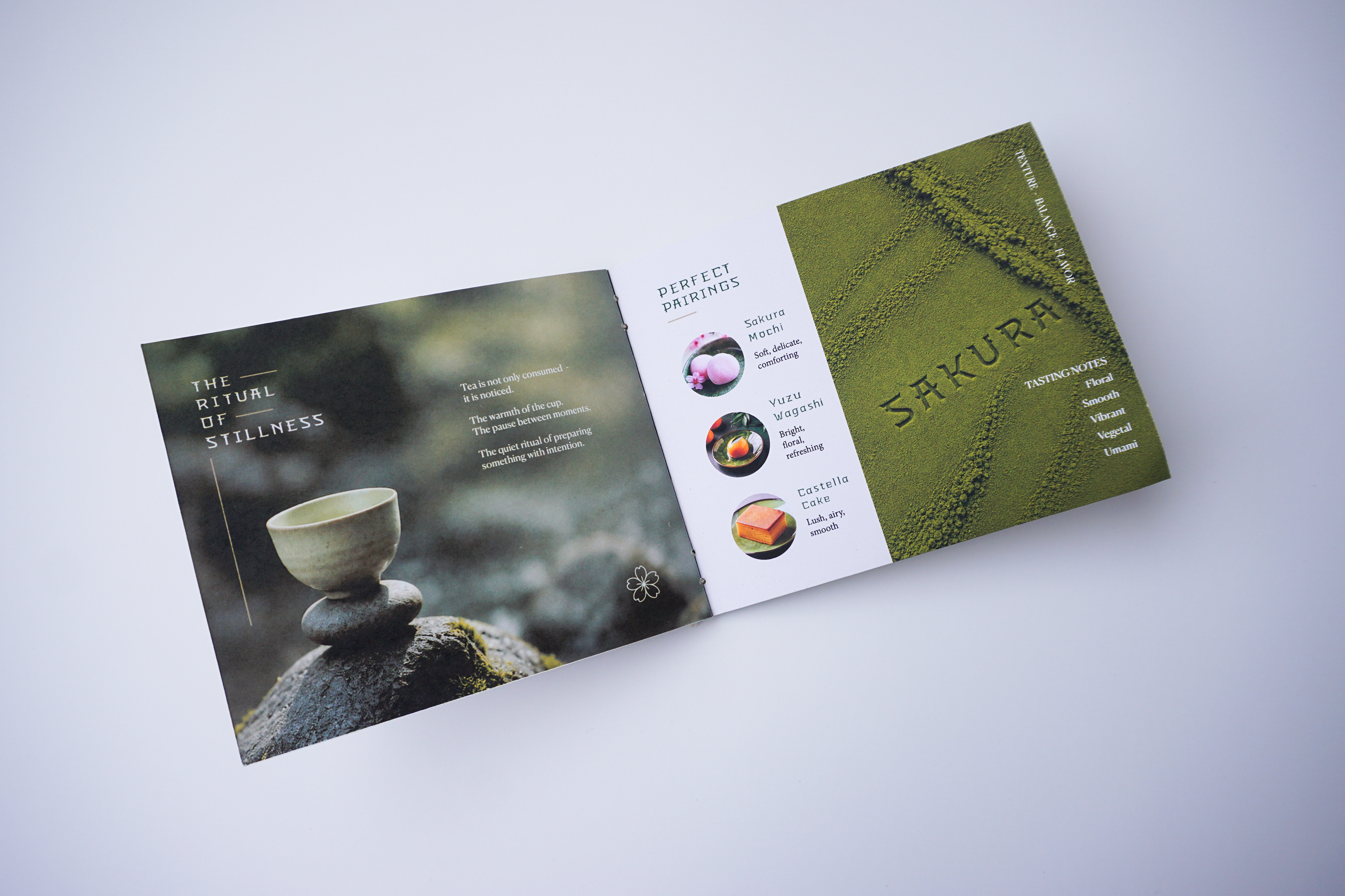
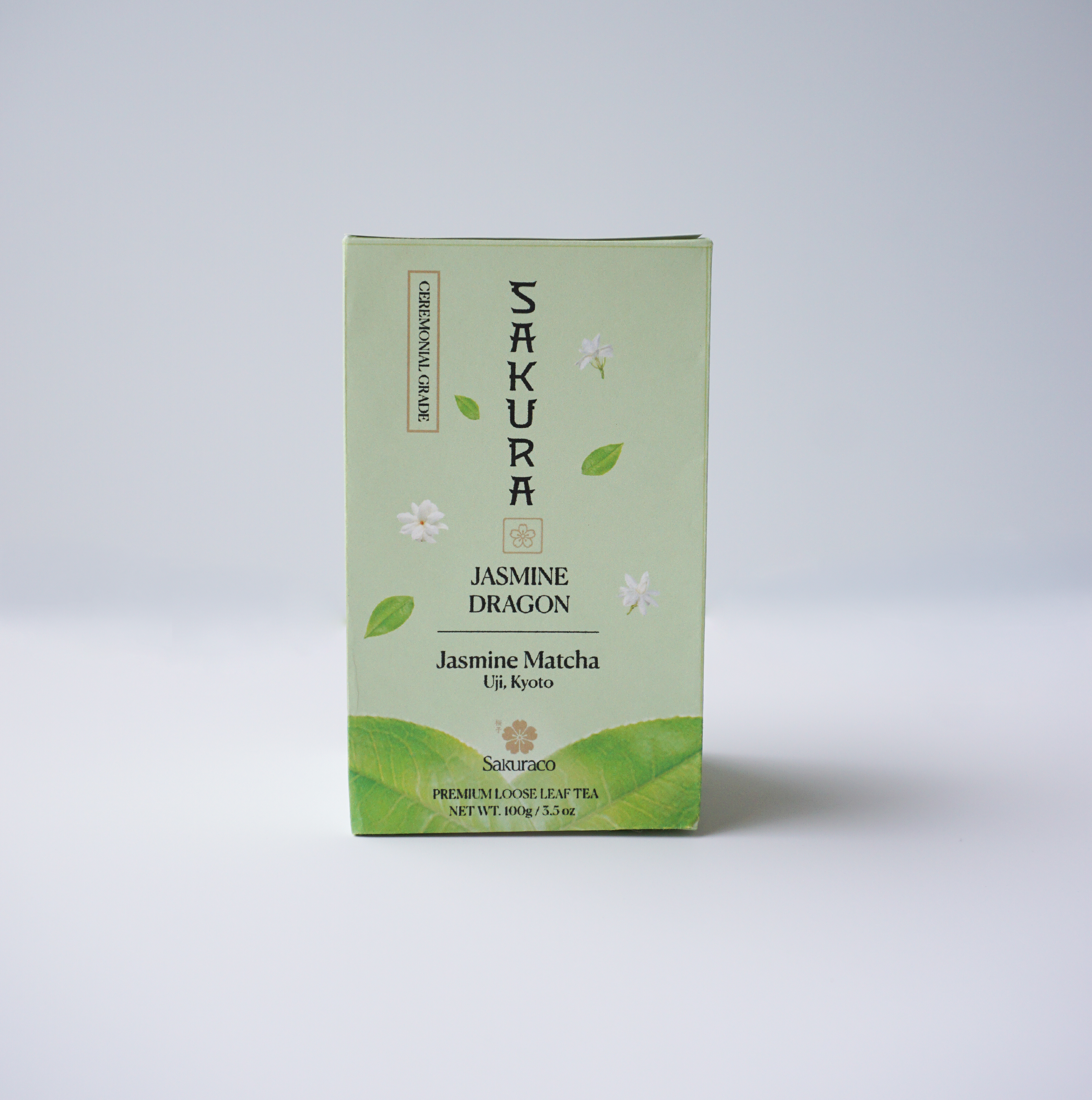
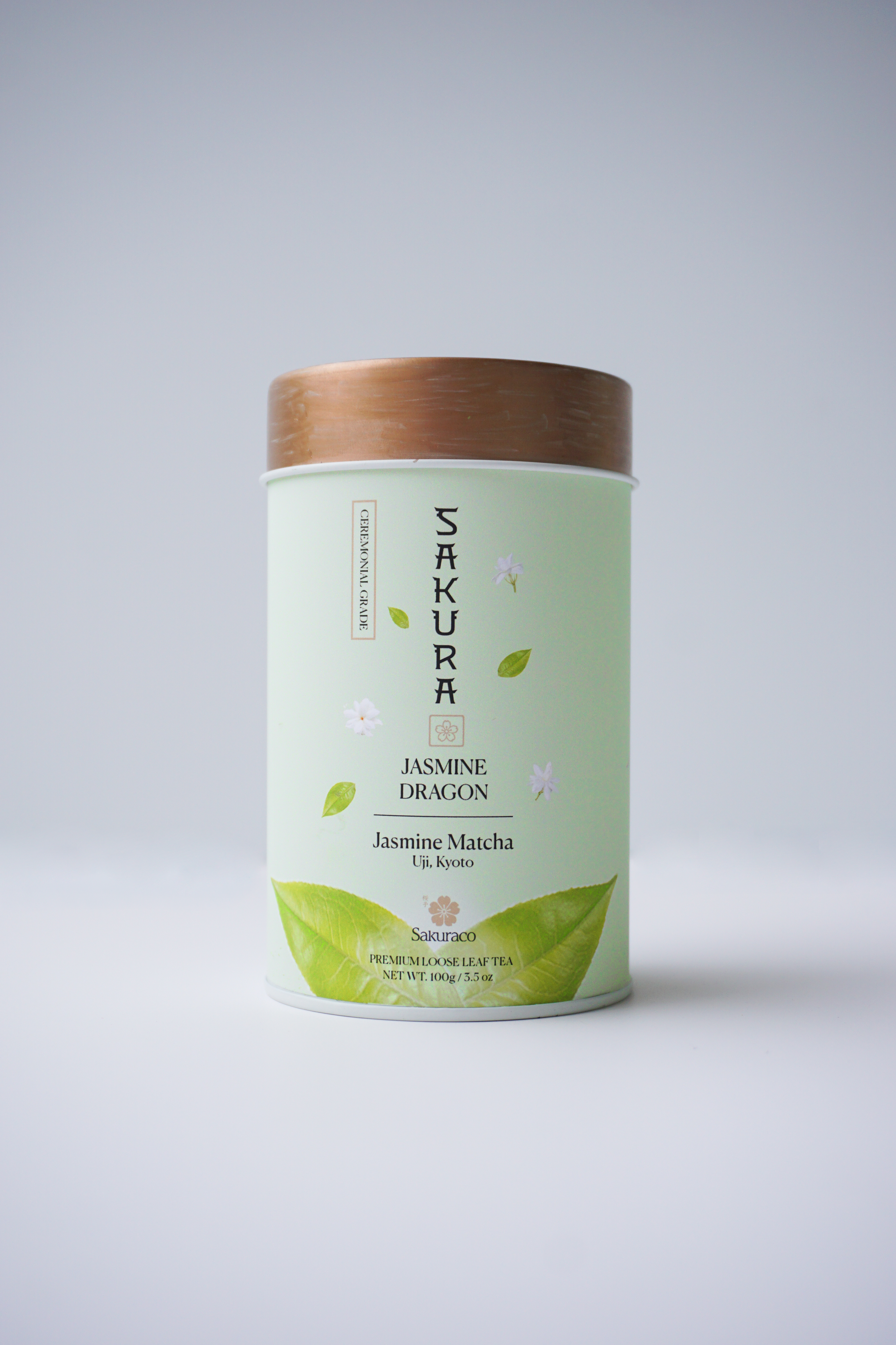
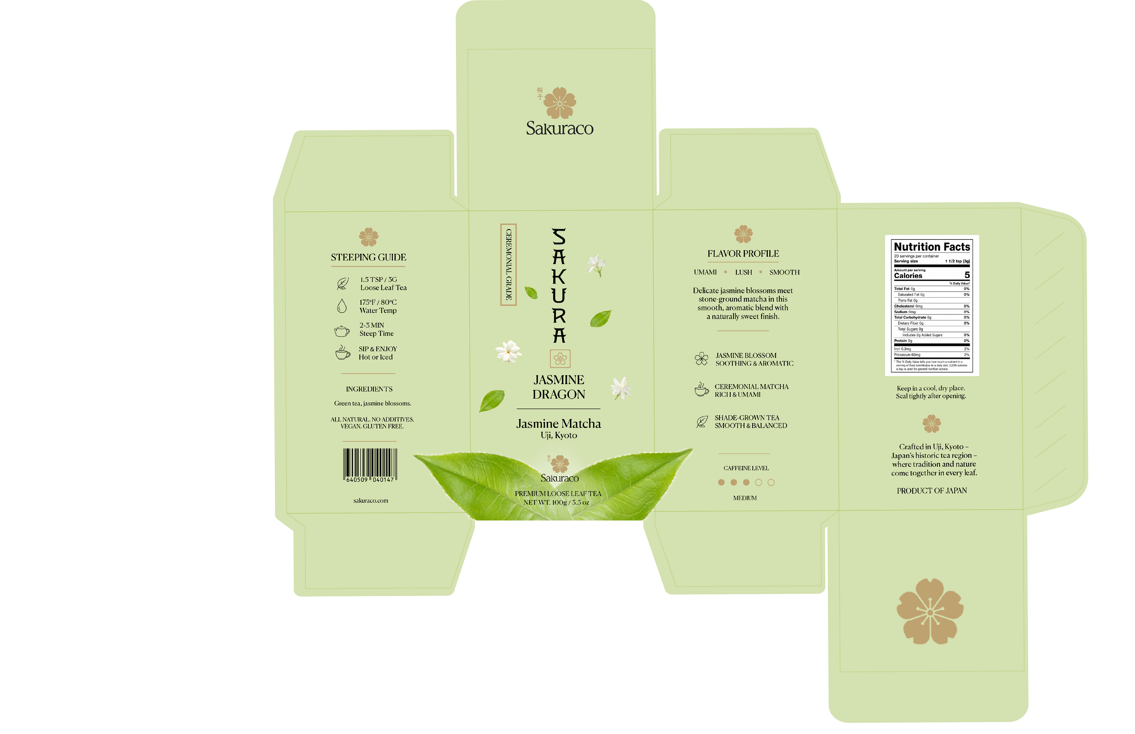
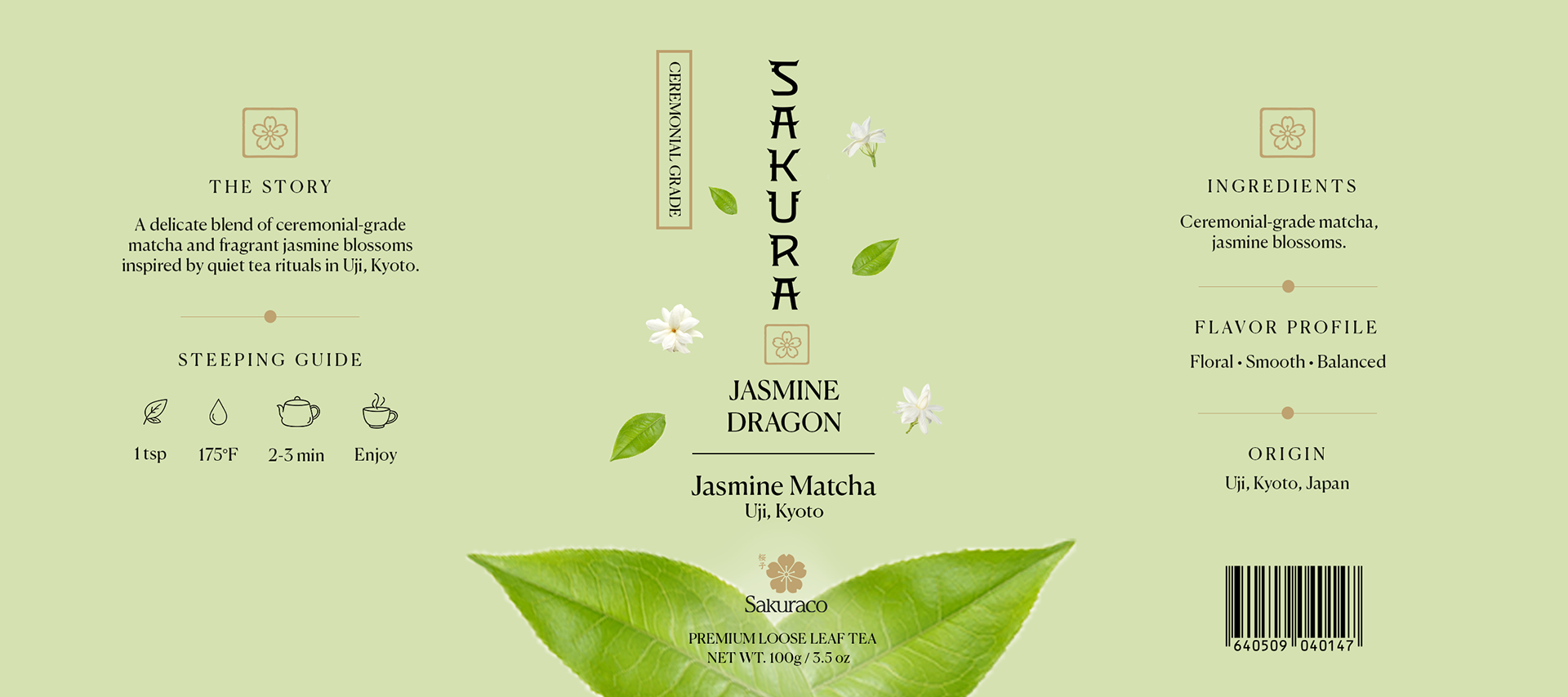
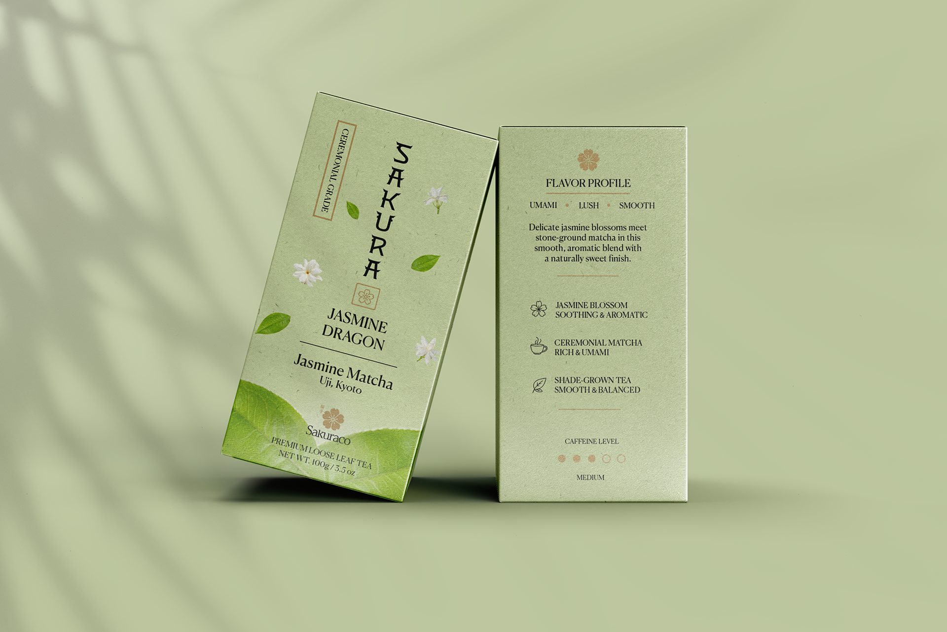
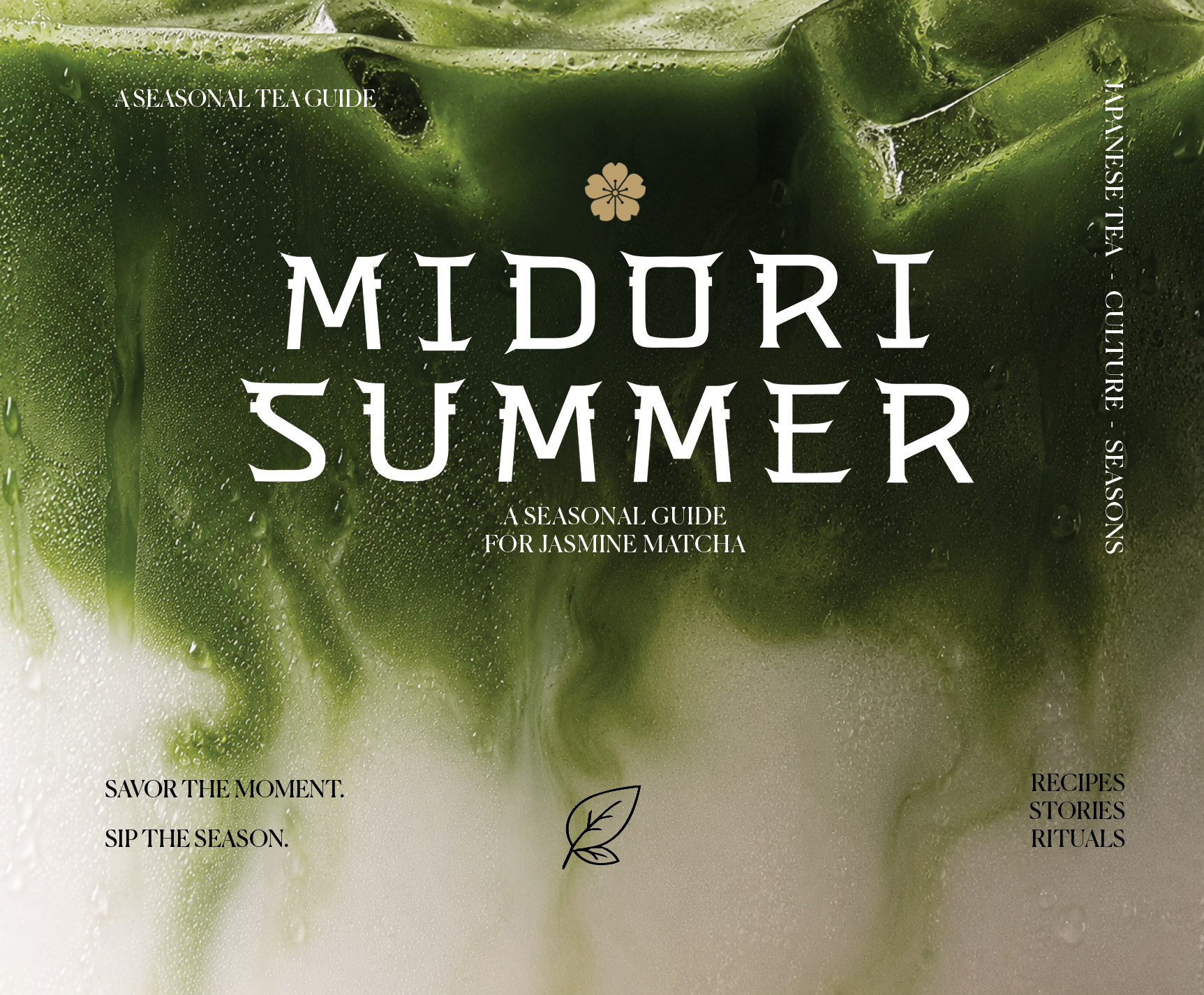
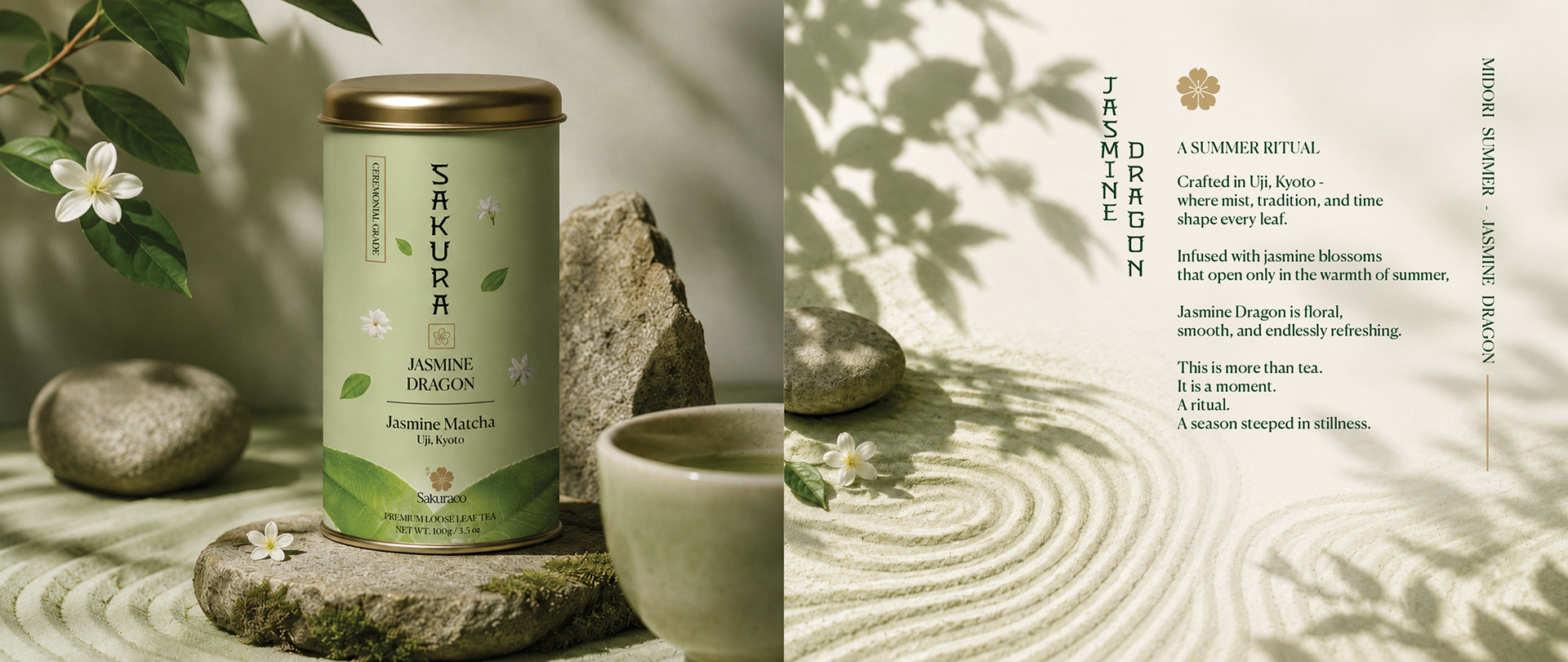
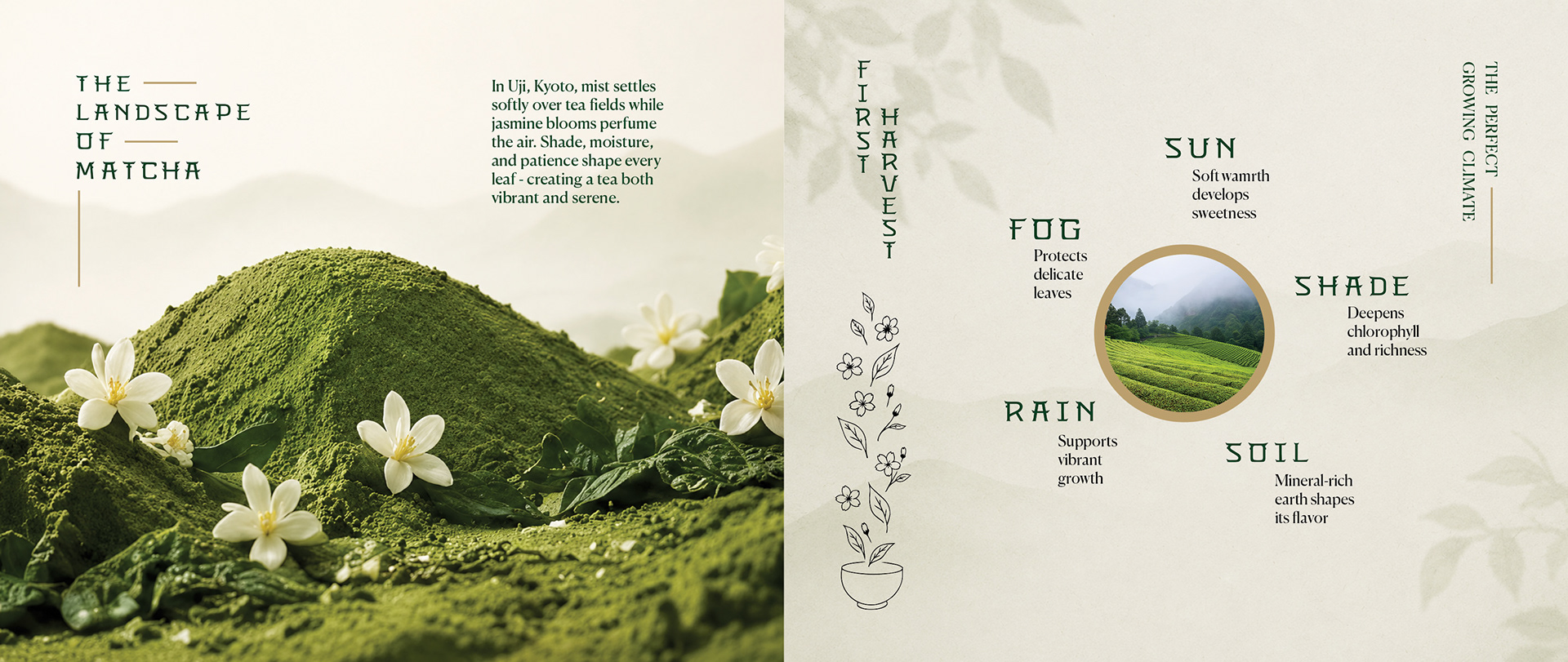
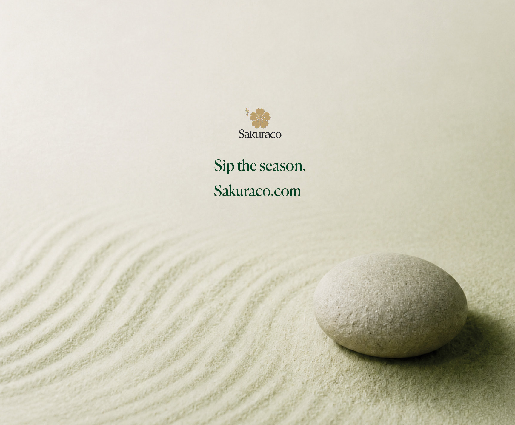
Shinto is a custom typeface designed for Sakuraco, a premium subscription brand featuring artisan teas, snacks, and ceramics sourced from across Japan. Developed as a conceptual brand system, the project is rooted in the quiet ritual of Japanese tea culture and the fleeting beauty of sakura and jasmine blossoms, exploring the intersection of tradition and modern refinement through typography, packaging, and sensory storytelling, centered around a jasmine-scented matcha blend, Jasmine Dragon. At the heart of the identity is a display typeface featuring branch-like serifs and oftened organic curves inspired by Japanese Shinto architecture, sakura trees, and natural forms. The visual system extends across packaging, brand applications, and tactile touchpoints designed to evoke calm, craftsmanship, and rituals.
Spec Work
Challenge
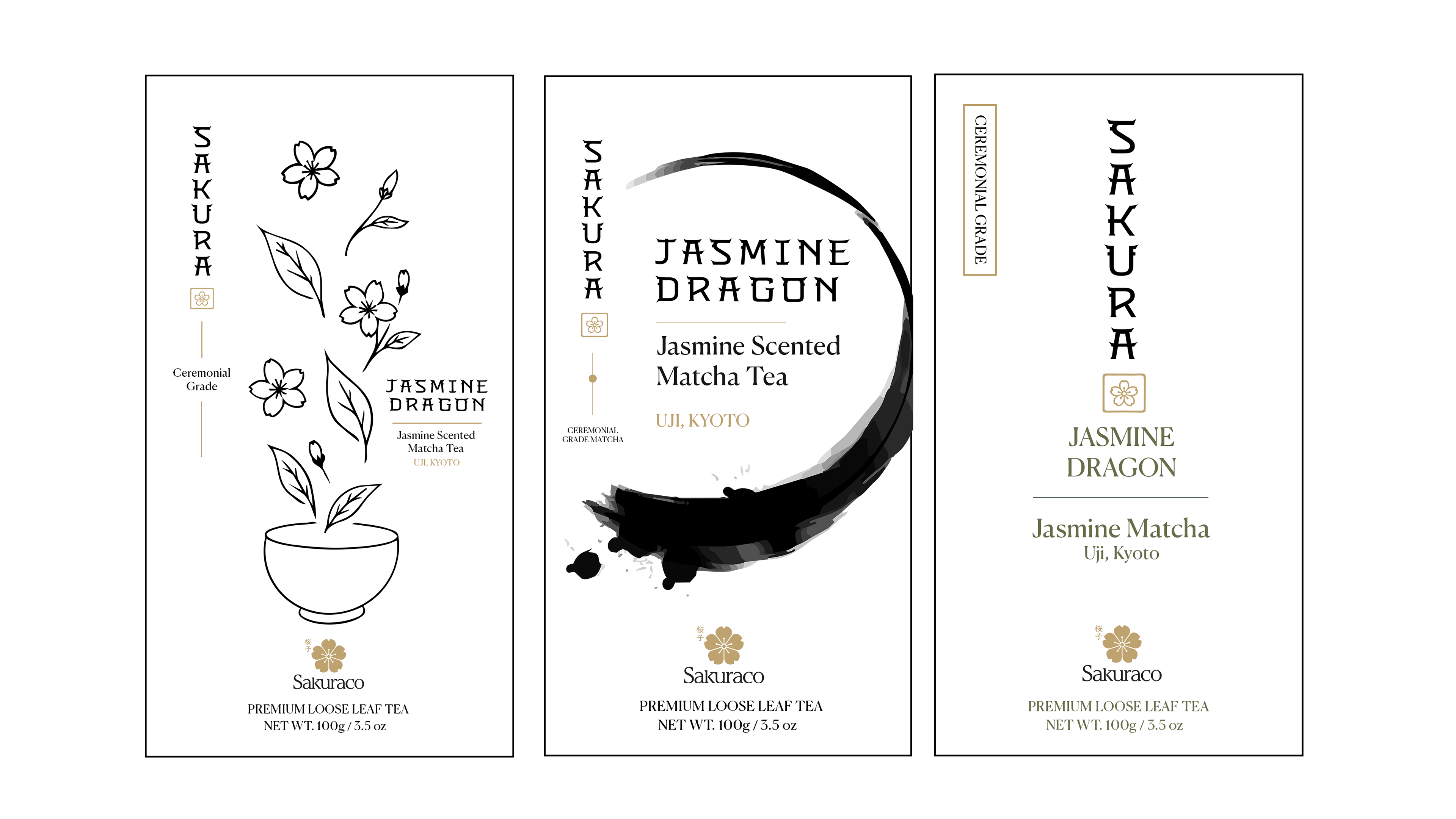
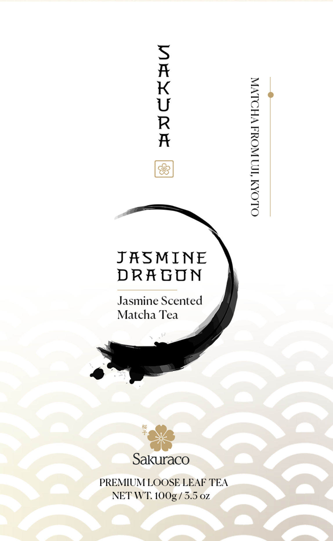
Many premium tea brands rely on familiar visual tropes to communicate Japanese heritage, often prioritizing decorative motifs over a distinctive design language. The challenge was to create a branded typeface and identity that conveyed craftsmanship, ritual, and quiet luxury through typography itself, building a visual system that felt contemporary while honoring the calm, intentional nature of the tea experience.
Approach
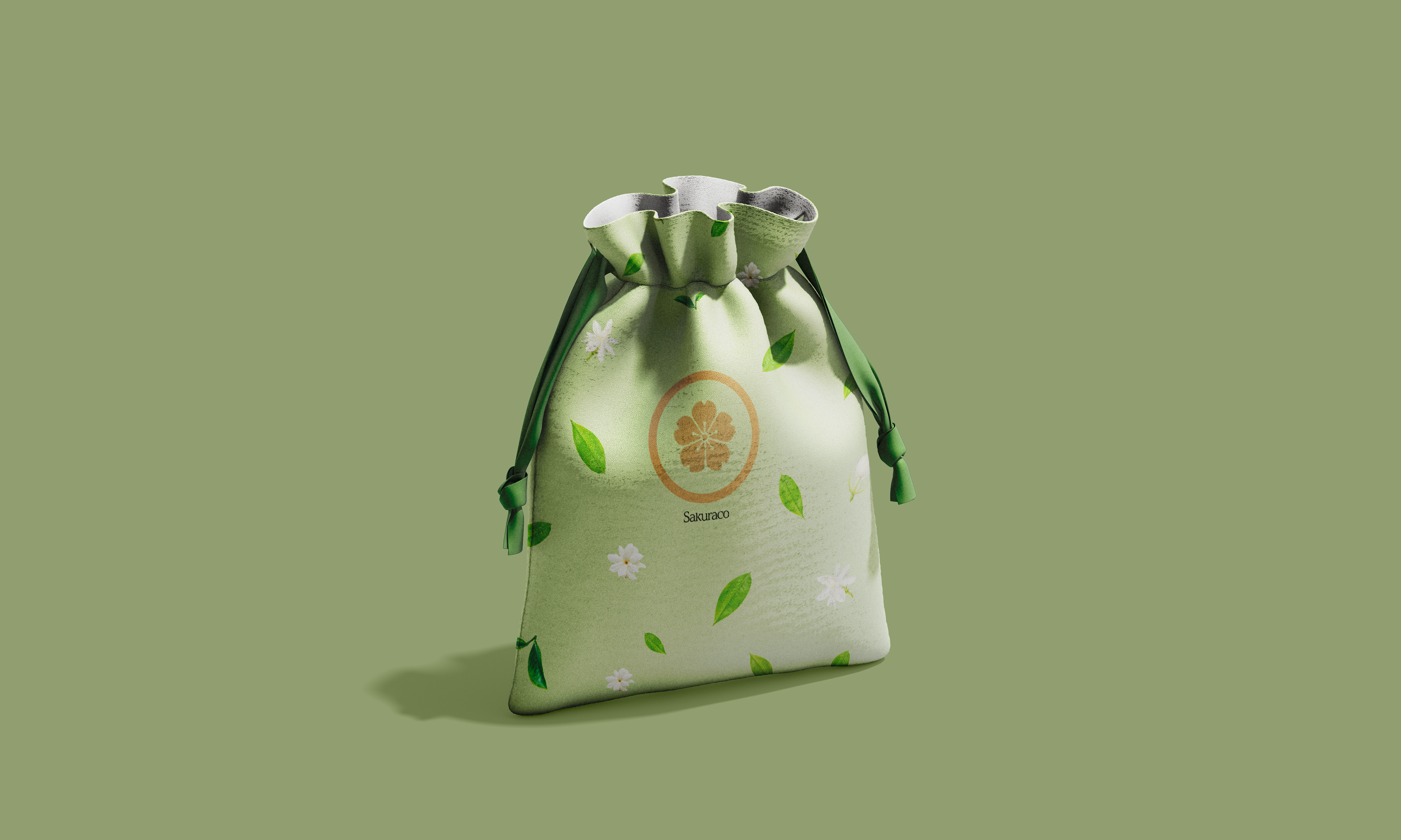
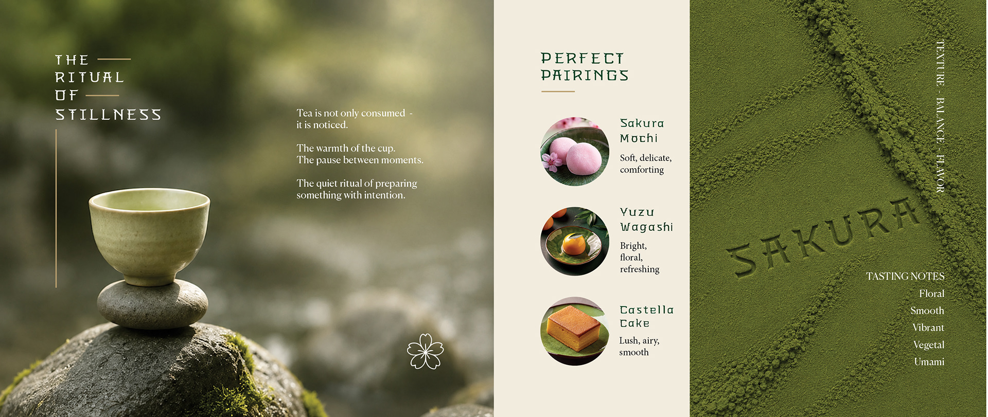
The typeface was inspired by the structural elegance of Shinto architecture, the organic rhythm of sakura branches, and the restrained beauty found in traditional Japanese design. Branch-like serifs, softened curves, and refined proportions became the foundation of a cohesive visual language that extended beyond typography into packaging and brand applications. Materiality, negative space, and understated details were used to create a tactile, sensory experience that reflected the ritual of preparing and enjoying tea. Rather than relying on overt cultural symbolism, the system communicates authenticity through thoughtful craftsmanship, subtle references, and emphasis on atmosphere.
Outcome
The result is a refined brand identity that positions the Jasmine Dragon tea blend as a premium, gift-worthy experience rooted in ritual and design. By allowing typography to become the primary storytelling device, the visual system creates a cohesive expression of elegance, calm, and craftsmanship across every touchpoint, elevating the product beyond packaging into a memorable brand experience.